

After the announcement of the new logo and the new identity of Deezer, we took the time to read all your comments and feedback in order to address your concerns and understand your feelings
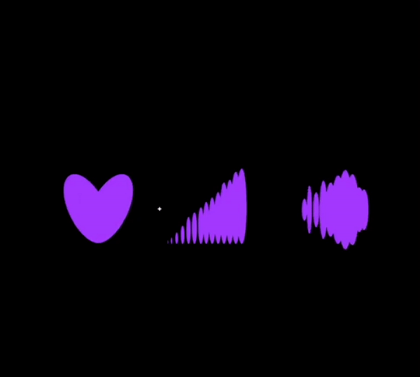
Opinions are very divided and several details were pointed out, including one that came up quite often: Why did you choose a heart 💜?
One comment cited “there is a more distant connection to music compared to the old logo”
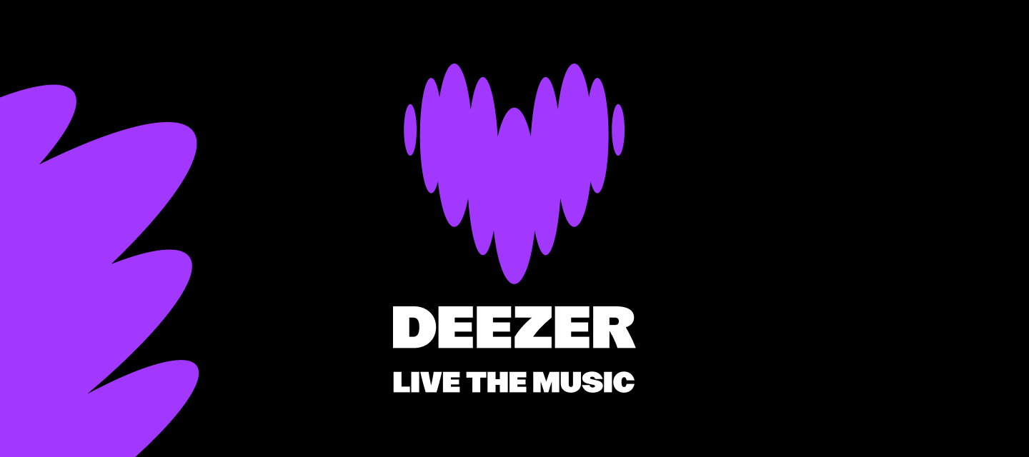
The beating purple heart simply represents love and passion for music. The shapes of the logo vary to signify musical rhythms. Its movement and pulsing quality directly reflect the essence of music and the human response to the listening experience, much like a heartbeat.
Another question was “why did you decide to change everything/what is the purpose of this new identity?”
Deezer helps you “be and belong,” going beyond streaming to empower fans, artists and partners to express themselves and connect through our products and services.
Refreshing our visual identity is essential as we enter this new era for Deezer. This allows us to connect emotionally with music fans, artists and strategists through visual cues that let people know that with Deezer they can experience music, not just listen to it.
“The choice to have prioritised this change was not the best, it would have been good to strengthen the user experience rather than degrade it.”
Satisfying our users experience is indeed crucial. Development and modification choices can be complex, which means that the change itself was so significant that some bugs crept in during this transition. All have been flagged by our developers and technicians, who are already fixing these errors.
The identity change will be present in all future app updates. We hope you will adopt the new design and enjoy the new Deezer experience.
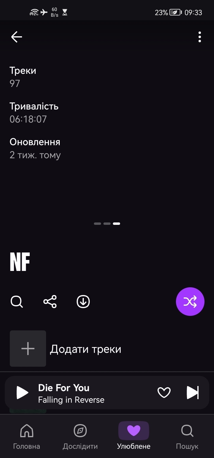
We adopt this new identity with pride, and although not everyone likes it yet, we still hope to find a place in your hearts 💜.