Also, what really annoys me, is when I pause the music at the end of a song, often it pauses, but then the next song is loaded, and it starts playing again. I don’t mind, that the next song is loaded, but if I hit pause, it should always stop playing.
Hey, I don’t understand why the volume control is in a hover over button. The bottom bar has more than enough space to fit it, just like Spotify does it. Any possibility to change that?
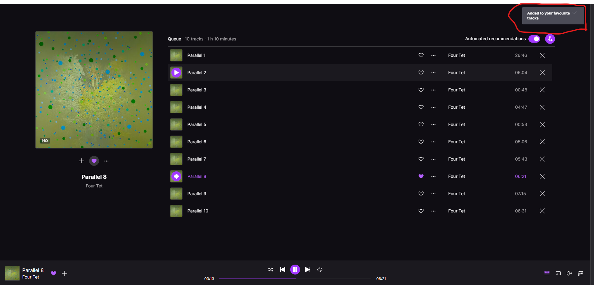
Hi, something that drives me nuts is that the pop-up notification on the webapp covers the drop down of the queue (and similar things the rest of the time) so if I, for example, like a song and want to exit the queue view, there’s a pointless 5s lag. It would be great if the notification could be moved over slightly so it doesn’t do that--maybe even the centre?
I’m a fan of the service, very settled in. I just find the editing abilities could be easily enhanced. I was trying to make room for new/other favourite artists. There are limits after all. (There were many that I was saying “why?” to myself.) But what a pain to remove artists/albums/songs from the favourites!. You deselect the heart and the app places you right back at the top of the list. So you have to go down and find where you left off. More painfull as you go down the list. No scroll bar visible. Just that little tweak- keep the view where it is at until you are done. A muli-select option of some kind. Not a big ask there.
Hi @dispossessed_spirit thank for your feedback. I know it is not ideal but you can always press ALT+ ← , and go back 15 seconds on the song every time you do it, and in a few clics you’ll be at the beginning of the song again. I’ll pass your feedback to our devs :)
My request is regarding the skip back/skip to previous track functionality. Apologies if this has been discussed before, there are a lot of comments in the thread here and I am busy.
This is for windows desktop application. Windows Edition, Version, & Build: Windows 10 Pro, omitting rest for privacy, can provide ver. and build direct to dev upon request. Deezer Version: 6.0.181
Sometimes I want to skip to the beginning of a currently playing track, and it seems the only way it seems I can do that is to skip to the previous track and then skip forward to the the track I want to listen to. Regardless of what point in the track’s timeline I use the backwards skip button or hotkey, it will go to the previous song.
I would prefer the functionality be more like Spotify’s, where a backwards skip will bring the user to the beginning of the current track if they are past a certain threshold point in the track timeline. The earlier point in the timeline of this threshold would be where the skip button takes the user to the previous track, and everything after jumps to the start of the track.
Another alternative to present functionality could be for the back skip to always take the user to the start of the current track with a few second time window after the “skip back” action that allow the user to press the back key again to skip to the previous track.
Desktop App: There seems to be no way to show the “time left” on the track I am playing. In other streaming services I just click on the “total time” and it will toggle between “total time” and “time left”.
Hi @pipperixi, thank you for your detailed feedback and for sharing your experience with us.
I understand your request for a global hotkey for the “Don’t recommend this track” feature and the challenges you're facing with current tools.
At the moment, we do not have a global hotkey feature in the Deezer app. However, I will share your suggestion with our developers for their consideration.
If you'd like, you can also submit your idea directly here to ensure it reaches the right team for evaluation.
Thank you for your patience and for being a dedicated Deezer user.
Can the Deezer app please have a global hotkey added for the “Don’t recommend this track” button? Thank you!
Details of request:
Original problem: I want a music streaming service in which I can press one button on my keyboard and I will never hear the current song again.
A nearly impossible request, humanity just isn’t there yet, I know, I know. But, I have actually been doing this for years with Deezer using a combination of Google Chrome + https://github.com/berrberr/streamkeys + various mouse software tools to remap mouse buttons to macros. Streamkeys is no longer updated, but I have been updating a fork whenever Deezer makes markup changes that break Streamkeys. I use Streamkey’s “Dislike” hotkey functionality coupled with Deezer’s “Don’t recommend this track” button. This has been very successful.
Deezer is the only streaming service I know of that allows “banning” infinite songs. Tidal has a 1,000 song “ban” limit. YouTube Music’s thumbs down does not “ban” a song, and now almost all the songs that are recommended to me are songs that I have already thumbs downed.
Current/upcoming problem(s)/risks:
Google Chrome is deprecating Web Manifest V2. Presumably this will cause me more upkeep for my cobbled-together fork of streamkeys. I otherwise perform no Chrome extension development. Or maybe this will make it impossible. I don’t know.
Firefox does not support global hotkeys for extensions.
The Deezer App does not have a global hotkey for this task, neither in its web interface nor its desktop app, despite it being the feature that separates it from every other streaming service.
I know that this feature will never be added. I am simply typing all of this for my own catharsis, to feel like I explored every avenue for having a button to press that does this basic task. Maybe I will explore using AutoHotKey in Windows to send clicks to the Deezer App. I also use Linux daily, so that won’t help me either.
Perhaps I will have grandchildren someday, and perhaps their children will have a button they can press to never hear a song again. A man can dream. A man can hope. A man can cry out in vain at the endless void for a request that the universe with its physical laws simply cannot fulfill. A button, that allows you, to never, hear, a song, again? Such a fantasy can only exist in the dreams of children and the psychotic. But still I persist, all hope of sanity now gone from even the deepest recesses of my mind.
Years have passed on this dream that a music streaming service, one of them, any of them, support this request. Did I ask for it to be cross-platform? No, despite needing it to be cross-platform. Did I ask for the “Don’t recommend this track” to actually never recommend a track again? No, because Deezer support already told me that Deezer does not support “banning” songs. So “don’t recommend” apparently means “recommend sometimes”? But I digress.
Like Edmond Dantès, I have toiled for years in solitude, yearning for freedom. Will someone help me? Will anyone help me? Do I have to scratch my way out of here with my own fingernails? Waiting years for them to regrow because the stone whittles them to nothing? Like waves crashing against the cliffside, hoping to transform it into a beach. A useless endeavor that could achieve success only by the passing of eons.
I know my fate. I will have to stay on Google Chrome forever, and learn, through pain, what cosmic horrors await me trying to forever maintain an aging extension on web manifest v3 to support this use case. A flicker of hope in an otherwise pitch black stain of existence.
Someday. Someday keyboards will have a button that can be pressed to dislike a song, and someday, a music streaming service will exist that never recommends disliked songs. Will it be in my lifetime? No.
Hello @Cupart we appreciate all the suggestions that are share here and in any other thread in our communities.
Most of these suggestion are shared with developers, product team and other stakeholders.
Nevertheless, there are suggestions that are not feasible due to resources, bandwidth, low number of voters, and other reasons.
Talking about the most recent suggestions, what I can say according to our desktop developers is that in following quarters there are plans to solve some of the bugs occurring in our app and also to bring some improvements.
Some of those improvements might be suggestions shared by our users in these forums.
@Cupart I understand your frustration, however I do not know the scope of Deezers’ abilities to monitor these threads. These are quite minor annoyances to me anyway. Have you tried sending your suggestion by mail? I’ve done so and kindly got told they forwarded my suggestion, but they also mentioned the forum, so I thought to try here.
Keep a positive and understanding perspective and have a good day :D
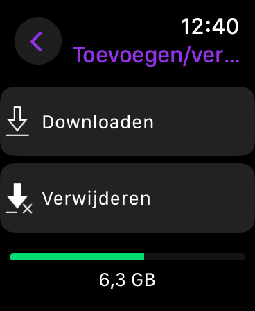
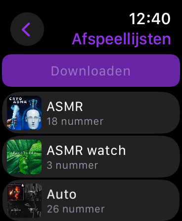
I would also like some more insights into the storage space a playlist would take up on my apple watch. Now if I want to download a playlist for offline use it does not show an error message or give insight as to if it is possible to download the playlist. If I do try it adds the playlist to the downloads, but it fails to download, without any indication. See attached screenshots.
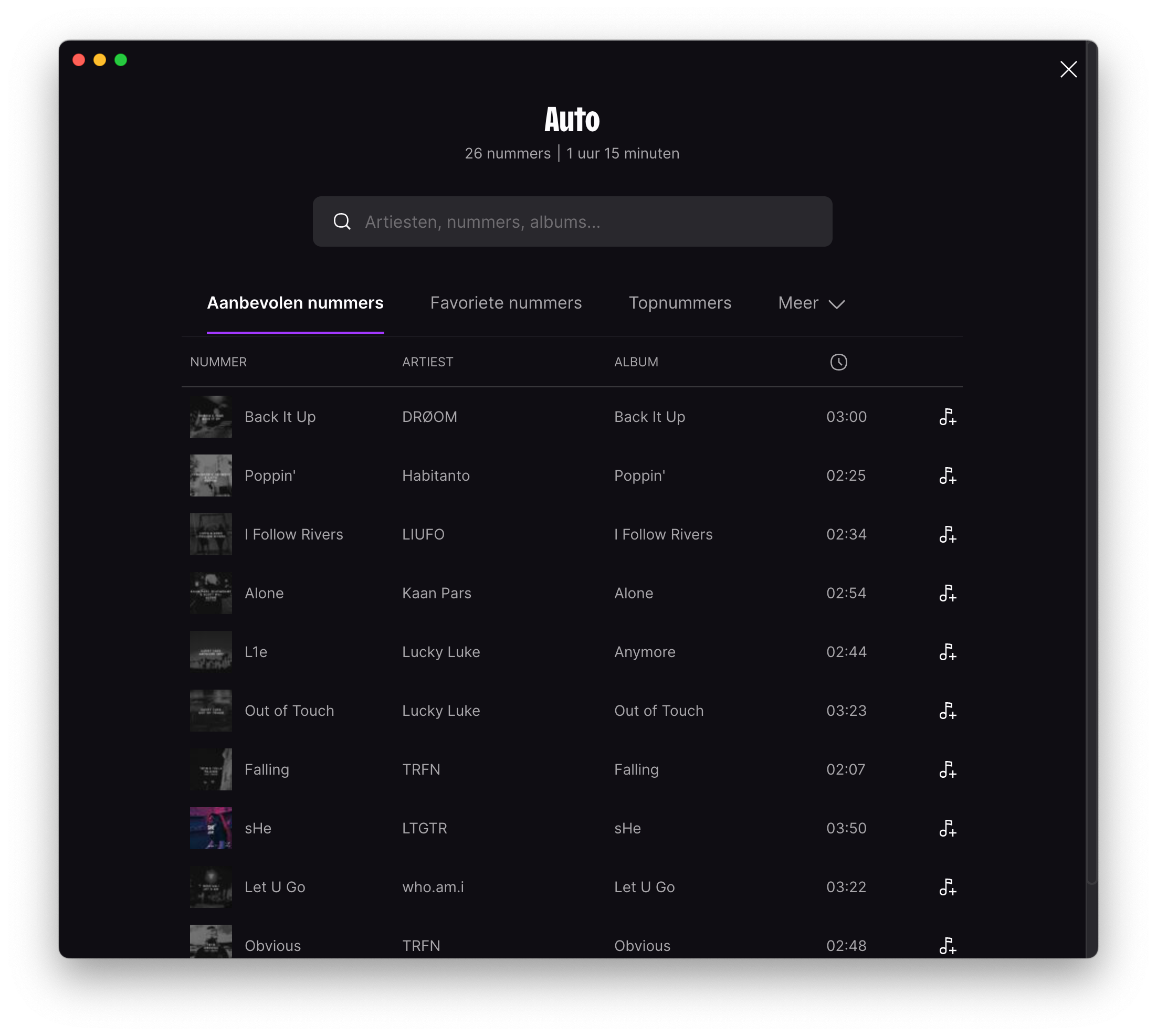
Also when I want to add suggested music to a playlist the suggestions do not offer the preview soundclip like the mobile application does; see attached picture. I would expect the cover image to show the play arrow to listen to the previously mentioned preview.
Could you make it possible to switch the dark mode on the desktop app based on system preferences? Because now it seems like I have to manually choose the display mode I would like. Although it is not a time consuming task, it is bothersome when other apps have already integrated this feature.
Do you really think anyone at Deezer is going to do anything about it? They cannot even get albums etc placed under the right artist, and when you flag it…… nothing happens.
Deezer could be miles ahead of the other music streaming services out there but their IT is not quite there yet, and it seems to be very much based on them and not the end user.
This said, I cross my fingers for you and hope I’m proven wrong.
You can get the app from the Store app as @jirikovoego has mentioned 👌
Also, what really annoys me, is when I pause the music at the end of a song, often it pauses, but then the next song is loaded, and it starts playing again. I don’t mind, that the next song is loaded, but if I hit pause, it should always stop playing.
Hey, I don’t understand why the volume control is in a hover over button. The bottom bar has more than enough space to fit it, just like Spotify does it. Any possibility to change that?
zghor wrote:
I would really like to see auto update option for desktop app. I dont like to check every time if newer version is online...thanks.
You can install Deezer via Store, if you are on Windows.
I would really like to see auto update option for desktop app. I dont like to check every time if newer version is online...thanks.
oh it’s hidden there in plain sight :) thanks! Totally overlooked it
I don’t use Windows, but I think the Android webapp is almost the same.
I can start/create a playlist by using the plus button on the left.
I’m probably stupid, but I can’t find the button to create a new playlist on windows desktop.
i looked in favourites > playlist and i cannot find it
Hi, something that drives me nuts is that the pop-up notification on the webapp covers the drop down of the queue (and similar things the rest of the time) so if I, for example, like a song and want to exit the queue view, there’s a pointless 5s lag. It would be great if the notification could be moved over slightly so it doesn’t do that--maybe even the centre?
Thanks for you feedback @Sedwend. I am not a developer, however I’ll pass your suggestion to our devs :)
I’m a fan of the service, very settled in. I just find the editing abilities could be easily enhanced. I was trying to make room for new/other favourite artists. There are limits after all. (There were many that I was saying “why?” to myself.) But what a pain to remove artists/albums/songs from the favourites!. You deselect the heart and the app places you right back at the top of the list. So you have to go down and find where you left off. More painfull as you go down the list. No scroll bar visible. Just that little tweak- keep the view where it is at until you are done. A muli-select option of some kind. Not a big ask there.
Thanks,
Brian
Hi @dispossessed_spirit thank for your feedback. I know it is not ideal but you can always press ALT+ ← , and go back 15 seconds on the song every time you do it, and in a few clics you’ll be at the beginning of the song again. I’ll pass your feedback to our devs :)
My request is regarding the skip back/skip to previous track functionality. Apologies if this has been discussed before, there are a lot of comments in the thread here and I am busy.
This is for windows desktop application. Windows Edition, Version, & Build: Windows 10 Pro, omitting rest for privacy, can provide ver. and build direct to dev upon request. Deezer Version: 6.0.181
Sometimes I want to skip to the beginning of a currently playing track, and it seems the only way it seems I can do that is to skip to the previous track and then skip forward to the the track I want to listen to. Regardless of what point in the track’s timeline I use the backwards skip button or hotkey, it will go to the previous song.
I would prefer the functionality be more like Spotify’s, where a backwards skip will bring the user to the beginning of the current track if they are past a certain threshold point in the track timeline. The earlier point in the timeline of this threshold would be where the skip button takes the user to the previous track, and everything after jumps to the start of the track.
Another alternative to present functionality could be for the back skip to always take the user to the start of the current track with a few second time window after the “skip back” action that allow the user to press the back key again to skip to the previous track.
Thanks.
Desktop App: There seems to be no way to show the “time left” on the track I am playing. In other streaming services I just click on the “total time” and it will toggle between “total time” and “time left”.
Hi @pipperixi, thank you for your detailed feedback and for sharing your experience with us.
I understand your request for a global hotkey for the “Don’t recommend this track” feature and the challenges you're facing with current tools.
At the moment, we do not have a global hotkey feature in the Deezer app. However, I will share your suggestion with our developers for their consideration.
If you'd like, you can also submit your idea directly here to ensure it reaches the right team for evaluation.
Thank you for your patience and for being a dedicated Deezer user.
Can the Deezer app please have a global hotkey added for the “Don’t recommend this track” button? Thank you!
Details of request:
Original problem: I want a music streaming service in which I can press one button on my keyboard and I will never hear the current song again.
A nearly impossible request, humanity just isn’t there yet, I know, I know. But, I have actually been doing this for years with Deezer using a combination of Google Chrome + https://github.com/berrberr/streamkeys + various mouse software tools to remap mouse buttons to macros. Streamkeys is no longer updated, but I have been updating a fork whenever Deezer makes markup changes that break Streamkeys. I use Streamkey’s “Dislike” hotkey functionality coupled with Deezer’s “Don’t recommend this track” button. This has been very successful.
Deezer is the only streaming service I know of that allows “banning” infinite songs. Tidal has a 1,000 song “ban” limit. YouTube Music’s thumbs down does not “ban” a song, and now almost all the songs that are recommended to me are songs that I have already thumbs downed.
Current/upcoming problem(s)/risks:
Google Chrome is deprecating Web Manifest V2. Presumably this will cause me more upkeep for my cobbled-together fork of streamkeys. I otherwise perform no Chrome extension development. Or maybe this will make it impossible. I don’t know.
Firefox does not support global hotkeys for extensions.
The Deezer App does not have a global hotkey for this task, neither in its web interface nor its desktop app, despite it being the feature that separates it from every other streaming service.
I know that this feature will never be added. I am simply typing all of this for my own catharsis, to feel like I explored every avenue for having a button to press that does this basic task. Maybe I will explore using AutoHotKey in Windows to send clicks to the Deezer App. I also use Linux daily, so that won’t help me either.
Perhaps I will have grandchildren someday, and perhaps their children will have a button they can press to never hear a song again. A man can dream. A man can hope. A man can cry out in vain at the endless void for a request that the universe with its physical laws simply cannot fulfill. A button, that allows you, to never, hear, a song, again? Such a fantasy can only exist in the dreams of children and the psychotic. But still I persist, all hope of sanity now gone from even the deepest recesses of my mind.
Years have passed on this dream that a music streaming service, one of them, any of them, support this request. Did I ask for it to be cross-platform? No, despite needing it to be cross-platform. Did I ask for the “Don’t recommend this track” to actually never recommend a track again? No, because Deezer support already told me that Deezer does not support “banning” songs. So “don’t recommend” apparently means “recommend sometimes”? But I digress.
Like Edmond Dantès, I have toiled for years in solitude, yearning for freedom. Will someone help me? Will anyone help me? Do I have to scratch my way out of here with my own fingernails? Waiting years for them to regrow because the stone whittles them to nothing? Like waves crashing against the cliffside, hoping to transform it into a beach. A useless endeavor that could achieve success only by the passing of eons.
I know my fate. I will have to stay on Google Chrome forever, and learn, through pain, what cosmic horrors await me trying to forever maintain an aging extension on web manifest v3 to support this use case. A flicker of hope in an otherwise pitch black stain of existence.
Someday. Someday keyboards will have a button that can be pressed to dislike a song, and someday, a music streaming service will exist that never recommends disliked songs. Will it be in my lifetime? No.
Hello @classicalking@lukevdijk thanks for sharing your ideas how to get a better experience using our Desktop app.
I will share these suggestions with our product team:
Feature that allows OS be sync with Deezer app for the Theme in use.
Gapless (that as been suggest before but we still don’t have info when it will be implemented)
The preview clip its a great suggestion when you are building a playlist
Apple watch, indeed would be great to have more info on what is happening when downloading content
Let’s hope in the future to have some of these suggestions implemented.
Hello @Cupart we appreciate all the suggestions that are share here and in any other thread in our communities.
Most of these suggestion are shared with developers, product team and other stakeholders.
Nevertheless, there are suggestions that are not feasible due to resources, bandwidth, low number of voters, and other reasons.
Talking about the most recent suggestions, what I can say according to our desktop developers is that in following quarters there are plans to solve some of the bugs occurring in our app and also to bring some improvements.
Some of those improvements might be suggestions shared by our users in these forums.
@Cupart I understand your frustration, however I do not know the scope of Deezers’ abilities to monitor these threads. These are quite minor annoyances to me anyway. Have you tried sending your suggestion by mail? I’ve done so and kindly got told they forwarded my suggestion, but they also mentioned the forum, so I thought to try here.
Keep a positive and understanding perspective and have a good day :D
@lukevdijk don’t hold your breath… No one is going to get back to you. See my comment from 12 days ago further up, and you will see what I mean :-)
I’m still hoping, that one day I will be proven wrong… Best of luck my friend
I would also like some more insights into the storage space a playlist would take up on my apple watch. Now if I want to download a playlist for offline use it does not show an error message or give insight as to if it is possible to download the playlist. If I do try it adds the playlist to the downloads, but it fails to download, without any indication. See attached screenshots.
Also when I want to add suggested music to a playlist the suggestions do not offer the preview soundclip like the mobile application does; see attached picture. I would expect the cover image to show the play arrow to listen to the previously mentioned preview.
Could you make it possible to switch the dark mode on the desktop app based on system preferences? Because now it seems like I have to manually choose the display mode I would like. Although it is not a time consuming task, it is bothersome when other apps have already integrated this feature.
Do you really think anyone at Deezer is going to do anything about it? They cannot even get albums etc placed under the right artist, and when you flag it…… nothing happens.
Deezer could be miles ahead of the other music streaming services out there but their IT is not quite there yet, and it seems to be very much based on them and not the end user.
This said, I cross my fingers for you and hope I’m proven wrong.