include
Feedback

Windows/Mac Deezer Desktop/Web App - Feedback for improvements

Windows/Mac Deezer Desktop/Web App - Feedback for improvements
Userlevel 7
Badge +7
  • The Godfather
  • 14344 replies


Our Desktop/Web app can improve, and we need your help :desktop:

This is the space for all those improvement calls you kindly make to us when looking at how to make our desktop and web apps better platforms.

What should I post here? :thinking:

  • if the app needs User Interface or User Experience (UI/UX) enhancements, let us know
  • if the app should be compatible with certain devices or audio outputs, we're with you
  • if there's a cool integration we should consider, shout out
  • and if any feature is missing, don't forget to mention

This topic is intended for version 4.20.0 and above, and for our browser version :floppy_disk:


290 replies

Userlevel 3
Badge

Come on, Deezer. Make the playlist folders and quick access on the left panel. Please. We really need it. 


Userlevel 1

Hello @Rudi !

Thanks for your interest.

Exclusive mode: This allows an application to claim audio device for only its own use. No other application can send another stream to the same device. Under normal circumstances, different applications can send different sample rated sounds to the audio device, hence windows mixer resamples all of those sources to a target sample rate which is the selected setting in the audio settings:

This is how we hear everything at the same time; For example windows sounds, youtube music and a game sounds being heard at the same time. However, this comes with a cost. That resampling degrades audio quality and internal windows audio processing negates some of the fidelty during the conversion. This is where exlusive mode shines. It claims the audio device exclusively (windows 10 - Wasapi API - event mode), simply enabling audio application to talk “directly” to the audio device, bypassing all windows sound processing engine. So, if my output is an external dac, then the audio app will send stream directly to the DAC, in a bit-perfect manner. The output will be cleaner, “clearer”. I hope this explanation helps.

Force Volume: I don’t know the exact technical implementation background. But I can guess that It is the second step bypassing the leftover “volume processing” by the windows (or the app). The app will send the stream directly to the device without any post-processing (dimming or turning up the volume) and leave all the volume to the external dac/sound card. In order to be able to prevent people from getting hearing-loss on their headphones or hi-fi speakers being maximized, the deezer app should allow an “audio output device” to be selected and claimed exlusively. Currenly, deezer only uses what is the primary device selected in windows. This is not good and needs to change…


To make these two ideas look *original* to the Deezer, I would give my opinion on how to be able to do it “differently” in Deezer with my poor paint.net skills. This is only one way that can be done:


Looks good enough? 🙂 
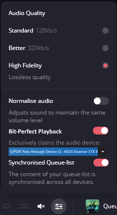
I hope this clarifies it. I also hope Deezer will NEVER jumps to the *loudness* bandwagon and only serves the audio as in its original form.


Important side-note: When this option is enabled, logically, the normalization and volume settings should be “grayed out”. Because, in order to achieve bit-perfect definition, those *bits* need to be exact and shouldn’t be modified, right? :)

Userlevel 1

Can you please add crossfade and gapless playback to the Mac desktop app, sometimes there's a three second or more  gap between tracks which sounds awful.

Spotify desktop app has it so its obviously possible

Userlevel 4
Badge +1

i have one idea:
choose cache folder, why? because at this way we can have the cache in other place and not in SSD( damaging it) and splitting it onto cache of music and downloaded music cache so we can choose if we want cache in HDD or wherever we want and downloads in other place.

my idea is because I have one laptop with ssd, if cache is choosen to be in ram I avoid write/reads on my ssd  and downloads in ssd so I avoid the download each time I open deezer. Maybe the election of cache but without downloads is  good too.

Userlevel 4
Badge +3

I don’t understand. Your iOS app is so great, why is your desktop app so crappy? It’s super ugly! And absolutetely not smooth  :( 

I’m afraid there’s no way to improve it. You should start from scratch again. Change design. Change framework on background.

Well in Windows the deezer icon in the taskbar has color but in Mac Os its black and white!
This Is Just a small detail I noticed that would be great if it gets fixed?


It would be great if the exe for the Windows app was made readily available, rather than being pushed to the Microsoft store. I bet there's a lot of people who don't touch those apps, like me, and would appreciate the ability to download an exe, which can be installed as needed.

Userlevel 2

Hi!

In the desktop app the progress bar that is supposed to show the playback progress of the track  currently playing is useless, because of the colors used.

Have a look at the pic below:

Can you tell, just by looking at the progress bar (and without zooming deep in the picture) where progress of the currently played track is?

I honestly do not understand the choice of colors: medium gray and medium purple on a thin line.

Did someone really think they would result in a clearly visible progress indicator?

(By the way, the Deezer desktop apps’s active-inactive window state is also indistinguishable on the app’ title bar as it is the same black in either case. Is this how it is intended?)


Thanks

Userlevel 1

I would love it if when you're a minute, minute and 45 seconds, 2 minutes, 2.5 etc. into a song, and you press the back/replay button, it starts from the beginning of that same song again and not completely go back to the previous song. You can do this on mobile but not the desktop, and it's quite annoying.

Also, the progress bar of the current song playing does not work on touchscreen devices. I can't manually go back x amount of seconds or minutes,


.

I have a suggestion for Deezer on a MAC (desktop app or web version); it would be nice to have the ability to side-swipe when browsing! This is kind of stupid to click on the little side arrows when you want to navigate left/right!

You cannot believe how many times, I just side-swipe on my Magic Trackpad, to be like aarrrrgh…:angry: I need to click on that little icon <>.

You can already navigate up/down & left/right on a phone, so implementation should be a no-brainer.


Like this post, if you like this idea!:thumbsup:

Userlevel 4
Badge

Hi Deezer team!


I have an idea about adding ‘current track’ actions to the tray icon menu. Something like this:

example

Maybe not this much folded sub-menus (too many clicks and moves), or just add to the playlist which was updated most recently or something like this. I think it may be useful while exploring new playlists/albums having the app minimized.


Thanks!

Userlevel 1

A bit annoying about the desktop application is that when browsing, for example, albums, clicking on it, and then returning to the list, we go back to the top of the page, not where we finished browsing. I don't know if I spoke English well, but I hope you know what I mean.

(I’m not sure if this was already discussed here, I just don’t know how to do a decent search in this thread)

Suggestion: desktop client - make currently playing song easier to locate

My favorites list is very long - over 500 titles.
When I play it, sometimes I want to look at the list and see what's coming up next, but for that I have to locate the currently playing song in the list.
This is very hard to do, as the list in the queue is long, and the only indication of the currently playing song is red title text, which is hard to find (I use dark mode). It used to be that the queue would open with the currently playing song at the top, but it doesn't do this now. 
So, why not have the currently playing song shown with a distinct background, so the whole line is highlighted and not just the title text? 

When I favourite a track, I also add it to one of my own playlists by its own genre. Likewise, when I’m listening to my own playlists, I unfavourite a track when I’ve grown tired of it and then delete using the desktop client at some point later(it seems the best way for me to keep the number of tracks I favourite under control otherwise I’ll exceed the 10k allowed in weeks :smile: ). 

It would be really useful to have the option of sorting unfavourited tracks to the top or bottom to make deletion easier when you have a LOT of tracks in a playlist. Every other column can be sorted the way you want except favourites. 


Userlevel 4
Badge +2

Hello,

Some thoughts on the desktop app, especially on macOS:

App framework (mostly macOS oriented)

  • It’s based on Electron, which is regrettable. We’d rather have a Mac Catalyst app (please let us run the iOS version on Apple Silicon macs at least).
  •  It’s still not compatible with Apple Silicon (M1 and the likes). Spotify is.
  • As far as I understand, it’s based on a now unsupported Electron version. The framework version reads 12.0.4 (https://www.electronjs.org/releases/stable?version=12&page=5#12.0.4), which was released on April 21st, 2021, has been superseded with numerous security updates in the v12 branch (it ended at 12.2.3 on November 15th, 2021), a branch that has reached end of support on November 16th, 2021 with the release of the v16 branch (https://www.electronjs.org/releases/stable?version=16&page=2#end-of-support-for-12xy-1600). I don’t like running apps with security issues.

App features

  • We miss a AirPlay 2 option in the app. Please bring this.
  • We miss a setting to follow the system light/dark mode.
  • We miss a way to make feedback from within the app: error on lyrics, tracks, artists or features, ideally with a follow up. 

Please make the best desktop app for the music lovers.

Best.


Userlevel 7
Badge +6

As well I want to make Deezer consider improving UI of their Settings on Web / Desktop apps

.

Generally very bad decision to have almost 8 tabs where on few tabs only few to see.

As well you need to click More tab to gain the rest just for few to see.

I am coming from Google Music (discontinued) where Settings was just one page. You just scrolled it from up to down and it was as easy as that. I feel like on Deezer is too complicated as you see.

You need to go from one tab to another and as well remember to check out More tabs.

May it be improved as well, thanks.

Userlevel 7
Badge +6

Hi there.

I use Deezer soon for a year.

I think generally everything is nice, but Profile seems to be hard to use on Web App.

Why it has so many tabs? You need like to click back and forth to get relevant information.

I heard that Followers feature will be discontinued, that is great as it would clean 2 tabs. However. There’s still much of them remaining and let’s face this problem. 9 tabs afterwords still too much.

Can it be reduced somehow? Perhaps add some features to other apps?

My personal opinion:

MP3’s I do not use nor need seperate tab for it.

Perhaps show option only inside playlists as MP3 playlist?

Mixes I do not use often and have only 5, perhaps keep them under playlists as another section just like you have “Collaborative playlists” or “Added playlists” besides the “Own playlists”?

Play history does not work with 40 tracks only. This could be transferred into a playlist as well?

My main aim is to say that currently profile requires too much of clicks on these 11 tabs.

Can it be worked as on Android I do not have this issue.

I want from Deezer minimalist clutter free experience and I know you can do it in Profile too.

Everything else is super fine in your app, so clutter free and minimalist.

Is there anyone here to add in this discussion about Profile UI on Web App/Desktop App?

Thank you!

Hi,


 I’m currently trying to replace my existing paid music streaming service.  I primarily use Windows Desktop and the Android app. Here are my initial thoughts on the Windows Desktop app UI:


Pros:

  1. Option for Light/Dark mode
  1. Ease of importing playlists
  1. Ability to opt-out of of data collection
  1. Only 1 missing song from all of my playlists after importing


Suggested Improvements:

  1. Playlists should to be accessible from the left sidebar and custom sort-able via drag/drop
  1. Add ability to drag/drop songs into playlists
  1. Volume adjustment should be directly on the main UI and should not require mouse-hovering over an element to appear
  1. X button currently minimizes to tray (heresy). It should CLOSE the app by default.
  1. Do not require use of the Windows App Store.

 All of these features require excess mouse clicks/movements to utilize. It makes everything feel cumbersome when coming from other apps. Unfortunately I saw that suggestion #1 was first seen over 2 years ago and marked as “Not for now”.  This is a deal-breaker for me. #4 was also first suggested years ago and has been dismissed for features users are “more keen for”.


I will try again in the future.


Userlevel 4
Badge +1

I see you have taken my suggest! congrats!


Userlevel 7
Badge +6

I see another problem on Deezer.

This problem does not exist on the service I use now.

When on Artist pages I want to know exact length of the track. I queue songs based on this.

I can’t see this info on the Deezer which makes ARTIST pages on Deezer not very useful.

Userlevel 7
Badge +7

It was a very good suggestion @Alblinux - thank you, the credit is also yours!
@FiftyFour thanks for that, there's also an idea in the ideas forum for that - have you voted for it? 

I am currently on the three month HIFI trial for deezer. For the most part the desktop app is ok. It plays music and its pretty easy to listen to albums. I looked online and people have been asking for a desktop EQ for a couple of years at this point. I’m not really understanding why this hasn’t been integrated yet. It’s really turning me off from purchasing a subscription. I think I would rather stick with spotify/equalify until they come out with HIFI. Just food for thought and I am aware it might not be the companies main priority, I just have expected it to have happened sooner.

Hey, I want to suggest a finding duplicates in playlists feature. Some playlists can grow pretty big and sometimes it’s hard to remember what you’ve already added. So, instead of typing song names in the search bar or scrolling through the list, it would be convinient to have a button that highlights songs that have the same title and artist, so you can quickly select and remove the duplicates from the list, if they’re there.

Userlevel 7
Badge +7

Excellent feedback @STeeL835 

I'll pass it on. The desktop app needs quite a few improvements but our teams are now fully aware of the shortcomings, due to feedback brought by the community, mostly. The good thing is that our big focus for 2021 is to improve connectivity and our desktop app as a whole, because of the potential it has to link up with other devices as well - especially for HiFi streaming.

The menu disappearing with the scrolling could be a bug, so I'll alert our devs about that :thumbsup_tone2:

Thank you for your optimisation remarks Dmitri @MrSkoper really good!

On the Windows Desktop app, for some reason we can’t double-click on a track in a Playlist to play it.

Confoundingly, you *can* double-click on a track name on the Artist Page to make it play. This lack of consistency is frustrating, and easy to fix.

Please allow all tracks in playlists or otherwise to be able to be double-clicked to play.

Reply