include
Feedback

Windows/Mac Deezer Desktop/Web App - Feedback for improvements

Windows/Mac Deezer Desktop/Web App - Feedback for improvements
Userlevel 7
Badge +7
  • The Godfather
  • 14344 replies


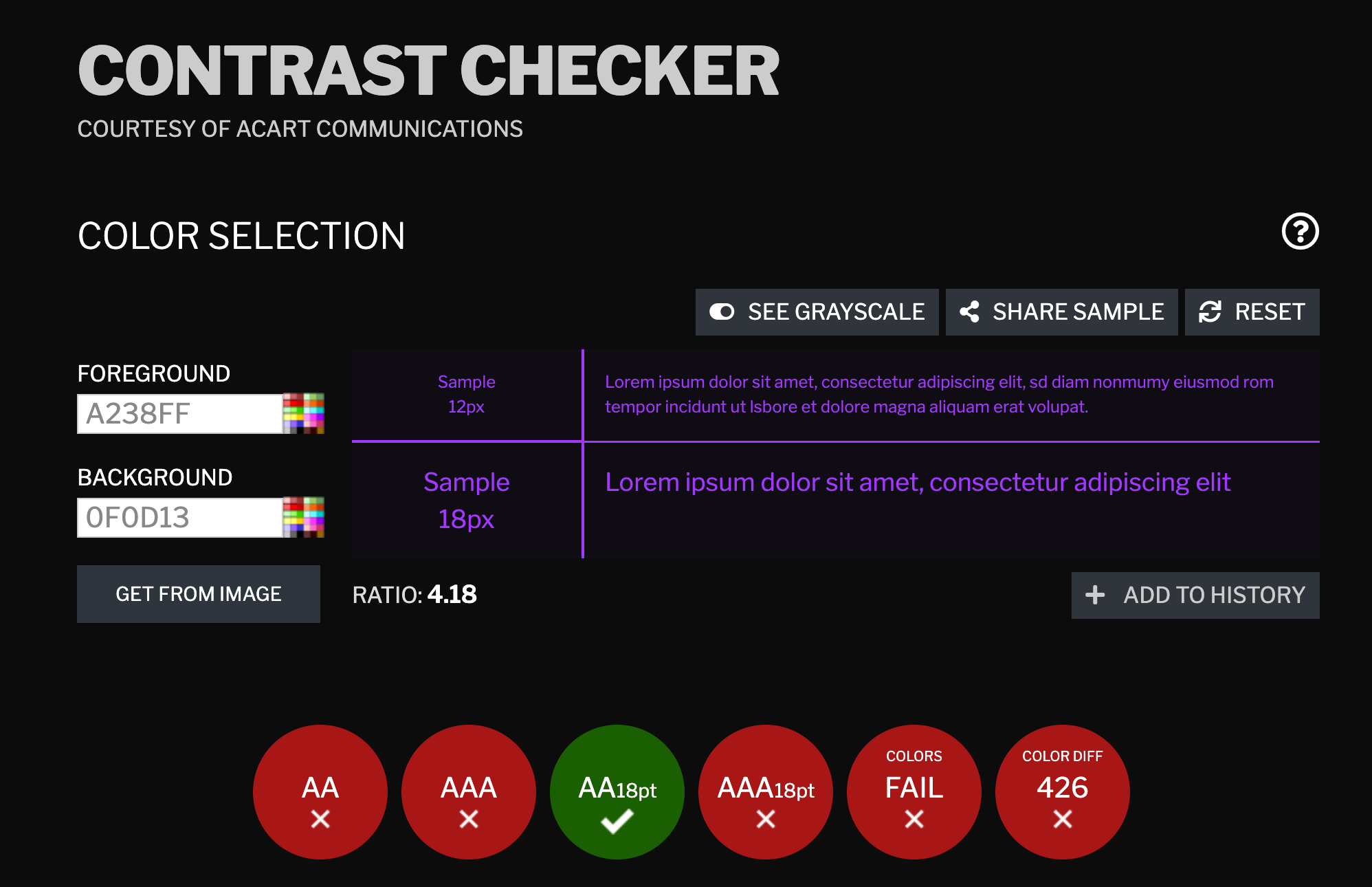
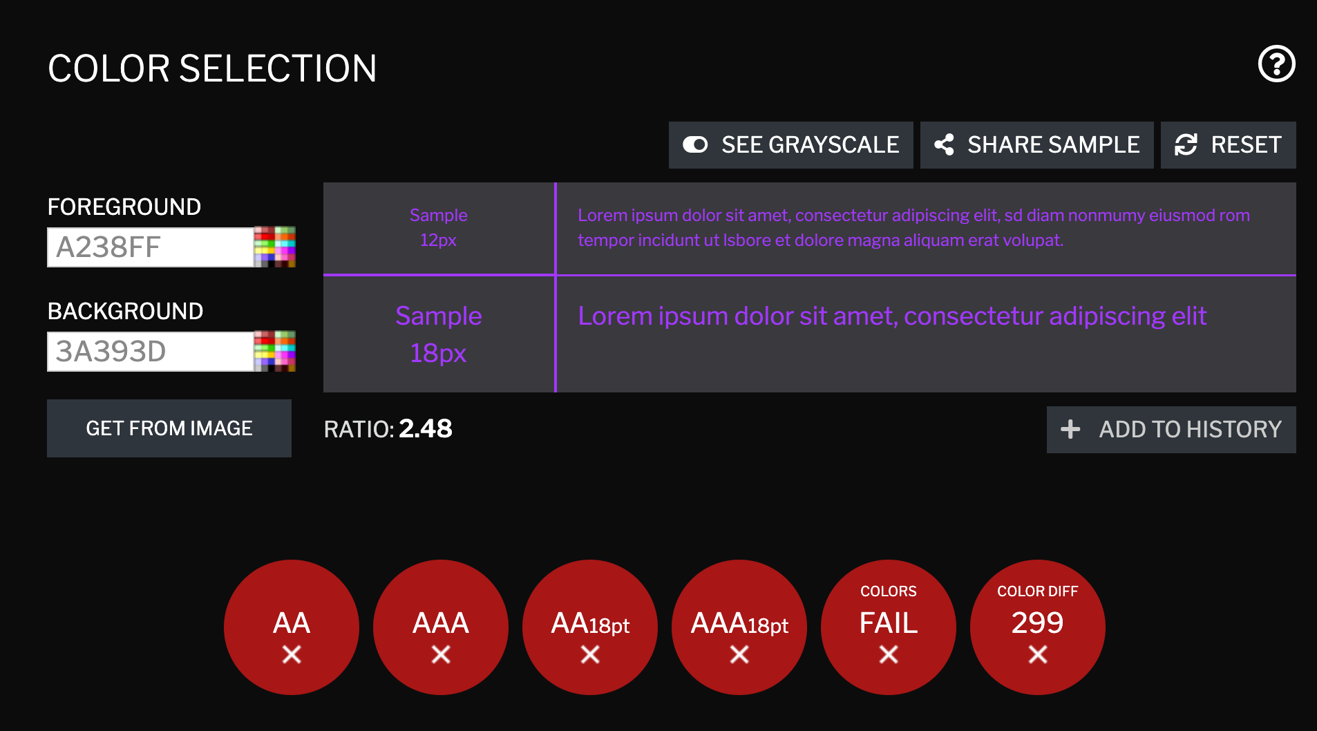
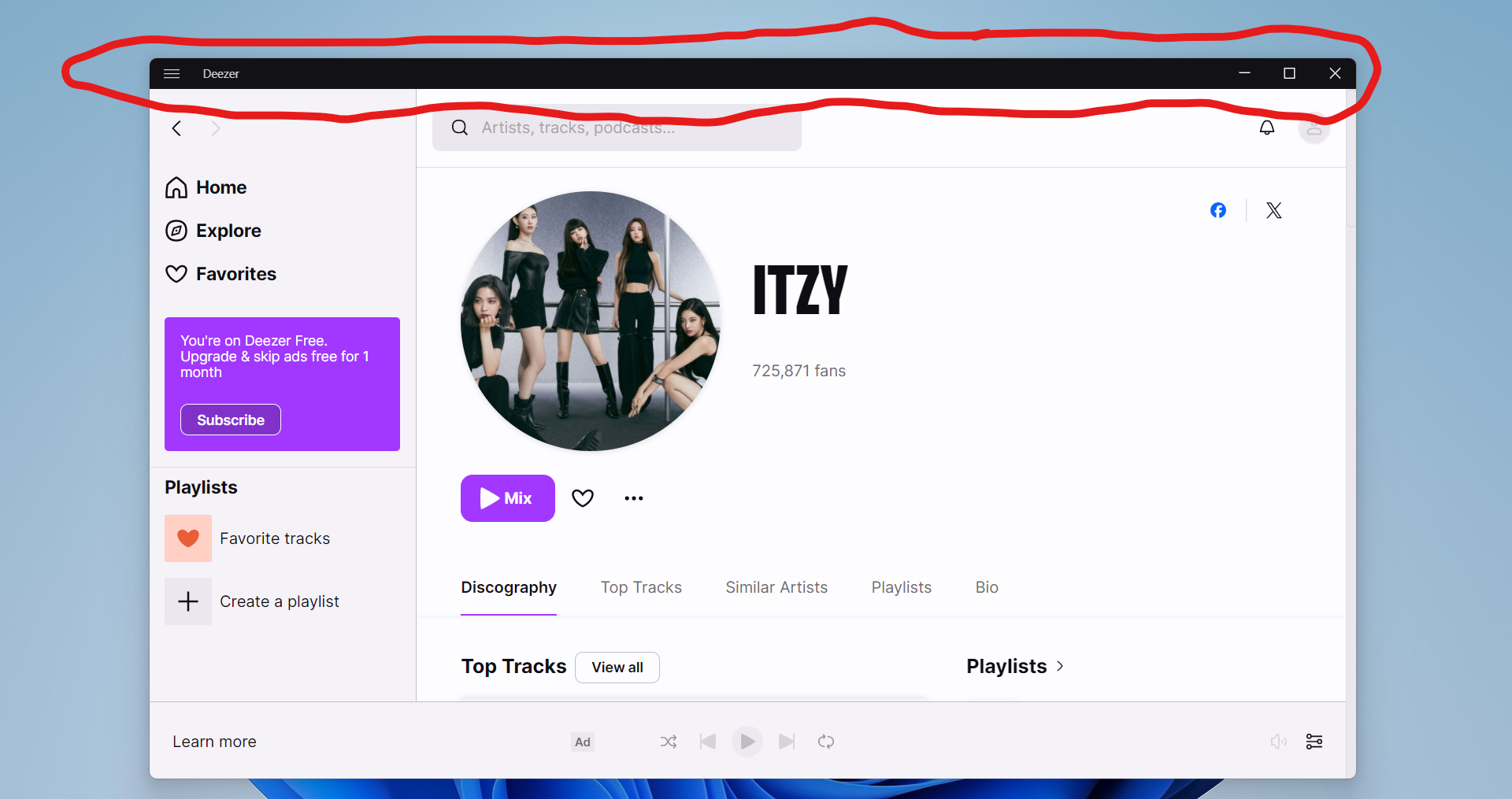
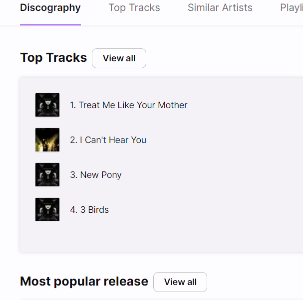
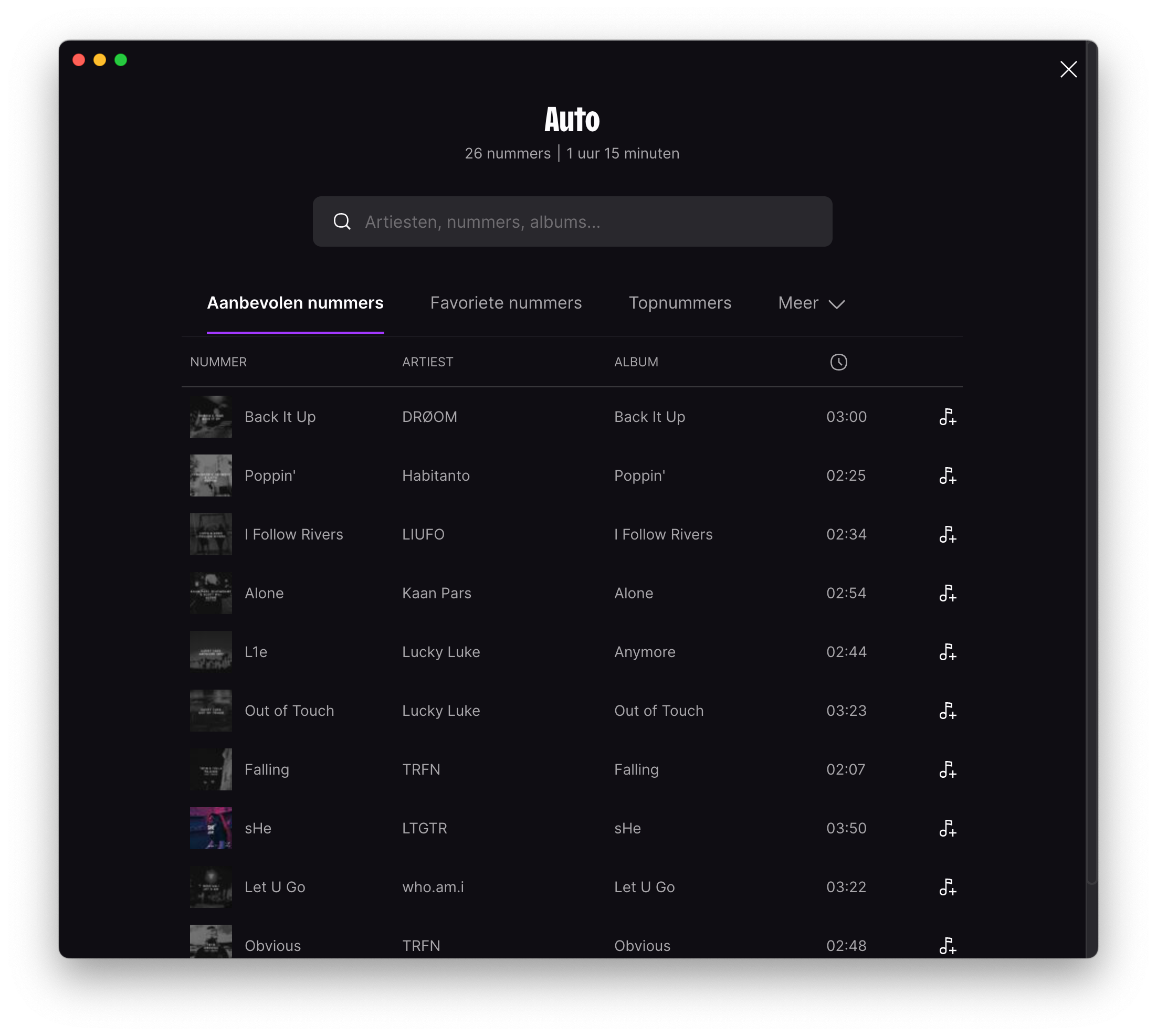
Our Desktop/Web app can improve, and we need your help :desktop:

This is the space for all those improvement calls you kindly make to us when looking at how to make our desktop and web apps better platforms.

What should I post here? :thinking:

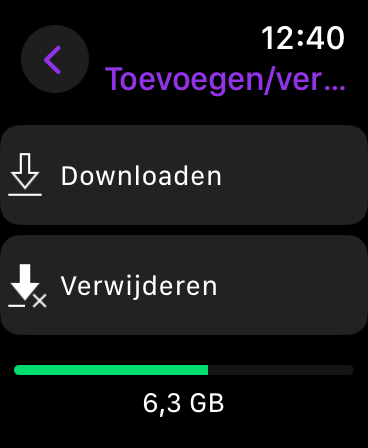
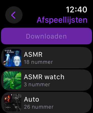
  • if the app needs User Interface or User Experience (UI/UX) enhancements, let us know
  • if the app should be compatible with certain devices or audio outputs, we're with you
  • if there's a cool integration we should consider, shout out
  • and if any feature is missing, don't forget to mention

This topic is intended for version 4.20.0 and above, and for our browser version :floppy_disk:


290 replies

Implement accessibility - for example, colour contrasts fail. It’s disappointing that this wasn’t even considered in the first place.

(I had posted a topic with screenshots about it, but staff deleted it.)


Hover state


On mac only the red zone allows to drag the window. There’s no visual cue to separate the search bar from the rest, or the icons from the top.

Also the left bar has no draggable zone.


It basically goes against every app design i’ve ever encounter and it’s a bit annoying.

Can you please add a way to access artists and albums from the home page like it used to be.

A lot of us don’t use playlist, please don’t design an app with just playlist user persona in mind.

Can you please add a way to access artists and albums from the home page like it used to be.

A lot of us don’t use playlist, please don’t design an app with just playlist user persona in mind.

(and it would avoid 3 loading times to access artists/albums: home, favourites and artist/albums)

Log in for the desktop application doesn’t log in and this really needs to be addressed.  Clicking ‘Log In’ creates a pop-up browser window that says I’m logged in but I cannot use the application anyway.  What purpose is there for having a piece of software that requires a login that doesn’t actually log the user in and instead requires the use of the website? 

On top of that, clicking the close button doesn’t close the thing.  This application does NOT need two minimize buttons.
This is nothing short of atrocious design.

Please allow the use of the “repeat” button when searching for songs, this works on the iOS app as expected, but is missing from the desktop app (grayed out):


Ugly Black Title Bar

UI feedback for the Windows desktop app

PLEASE change the color of the window title bar to white, so that it matches the rest of the light theme of the app. The black bar looks extremely ugly.

Userlevel 7
Badge +5

Hi @Harm133, thank you for sharing your feedback.

Unfortunately, the "repeat" button is not available on the desktop app when searching for songs.

However, I have a workaround to offer: consider adding the music you enjoy to your favorites or a playlist.

This way, you can listen to your preferred tracks as many times as you'd like.

If you have any more questions or suggestions, feel free to let me know!


Userlevel 7
Badge +5

Hi @Danxx, thank you so much for your suggestion.

I've already forwarded your information to our developers.

Your feedback is truly valued and appreciated.

If there's anything else you'd like to share or discuss, feel free to let me know.

The “Discography” should show the discography- that’s what I’m looking for on that tab! If I want to find top tracks I’ll go to “Top Tracks”. If I want to find similar artists or playlists, I’ll click on those tabs. If developers want to have an overview with as much random stuff crammed in, maybe make an “Overview” tab.


Userlevel 7
Badge +7

Thanks for your feedback @deathgrowl I have passed it to our devs.
I can’t guarantee any changes though 

Greetings to the deezer community and developers. I want to recommend a little improvement to the desktop version of the app. 
1st, in full-screen mode, make it possible to reduce the left section for more space.
2nd, make a small window to save space when a person listens to an album or their tracks.
3rd, make a small footnote of information about the artist (BIO, Latest release, Upcoming tour).

Please allow for the sidebar to be hidden.  I never listen to playlists on desktop and it takes up approximately 1/6 of my screen (and makes it look busy).

I don't know if users who read this will agree with me or not, but I seriously need a progress bar for the “My MP3” function. I can't stress enough thinking if the upload is done, if there was an error etc. Please consider this because it's really a pain not knowing my upload status and I really wanna use that feature in its best.

Userlevel 7
Badge +5

Hi @Paolo45 @cheesecycle @3ntry thanks for sharing your ideas. Really some good stuff here.

I have just shared them with Desktop developers. Fingers cross that some or all of them can be implemented in the future.

Reply