Icon looks like dating app, desktop app still electron with the same bugs (icons don’t work, can’t close with close button....). At least you could fix these bugs :(
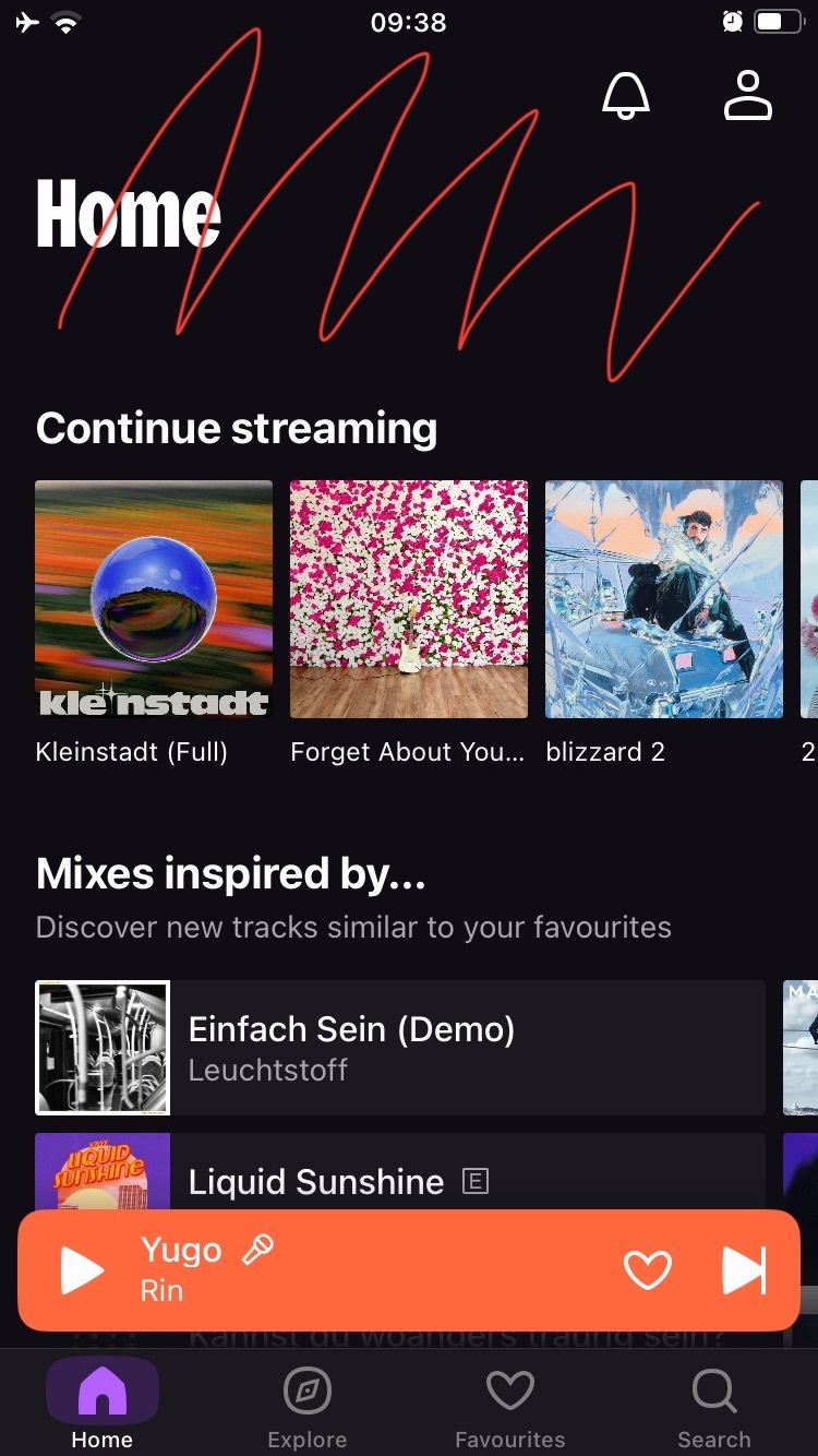
I honestly don’t mind the new design. I don’t think Deezer needed to do a major update like this, but whatever. I don’t like that it’s getting closer to what Spotify looks like. There’s a reason I don’t use Spotify, and their UI is like top 3 reasons.
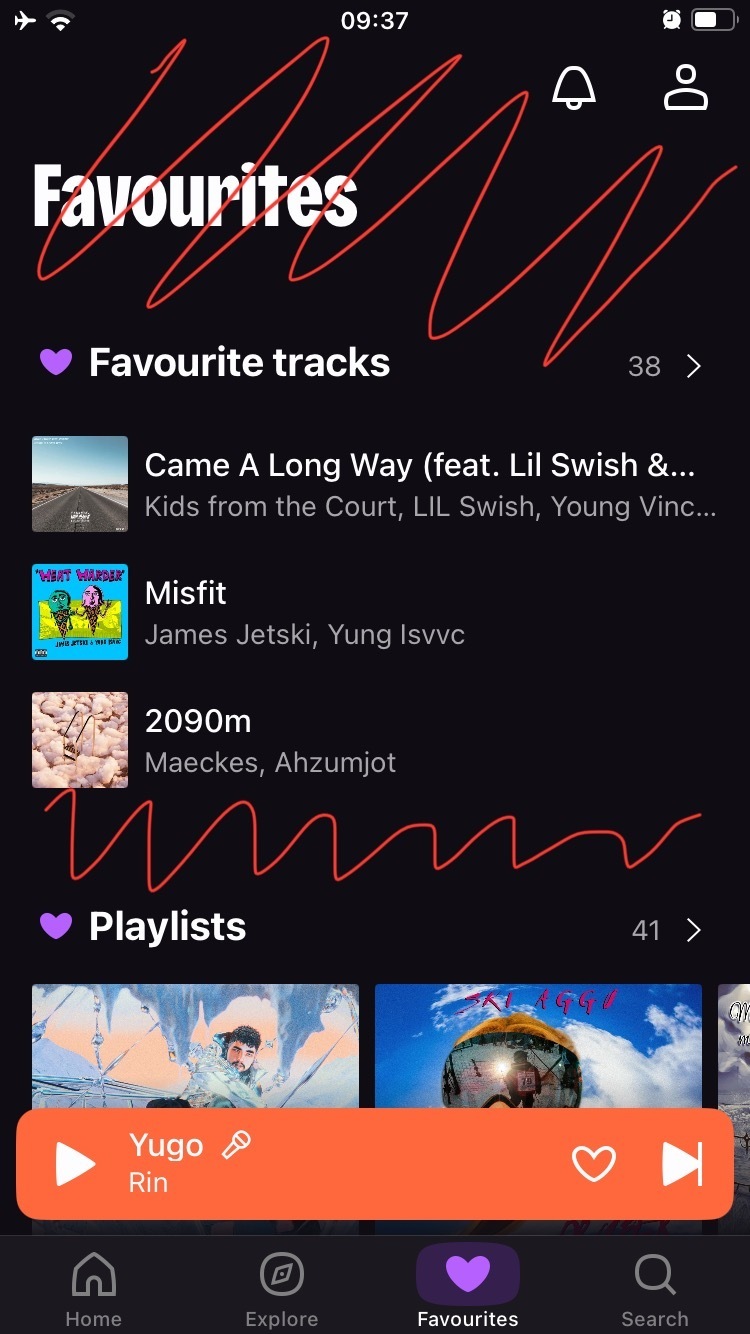
The worst part of this update is the now playing screen. The swipe down gesture is so much worse. Half the time it accidentally plays the next song instead of swiping down to the tray.
I honestly don’t mind the new design. I don’t think Deezer needed to do a major update like this, but whatever. I don’t like that it’s getting closer to what Spotify looks like. There’s a reason I don’t use Spotify, and their UI is like top 3 reasons.
The worst part of this update is the now playing screen. The swipe down gesture is so much worse. Half the time it accidentally plays the next song instead of swiping down to the tray.
I have a few pet peeves like lots of wasted space in headers and a few bugs but I think the redesign is neat, good job on not pulling spotify-grade shittification redesign!
Thanks for all your feedback. The new logo symbolises Deezer's unwavering commitment to delivering an immersive and interactive music experience. The beating purple heart represents the love and passion for music, instilling a sense of belonging in the Deezer experience.
Thank you @Jaime., we understand why new logo. Can we start talking about Desktop app experience? For example, why 6.0 has been released with new design only, but all annoying bugs are persisted?