

 +7
+7
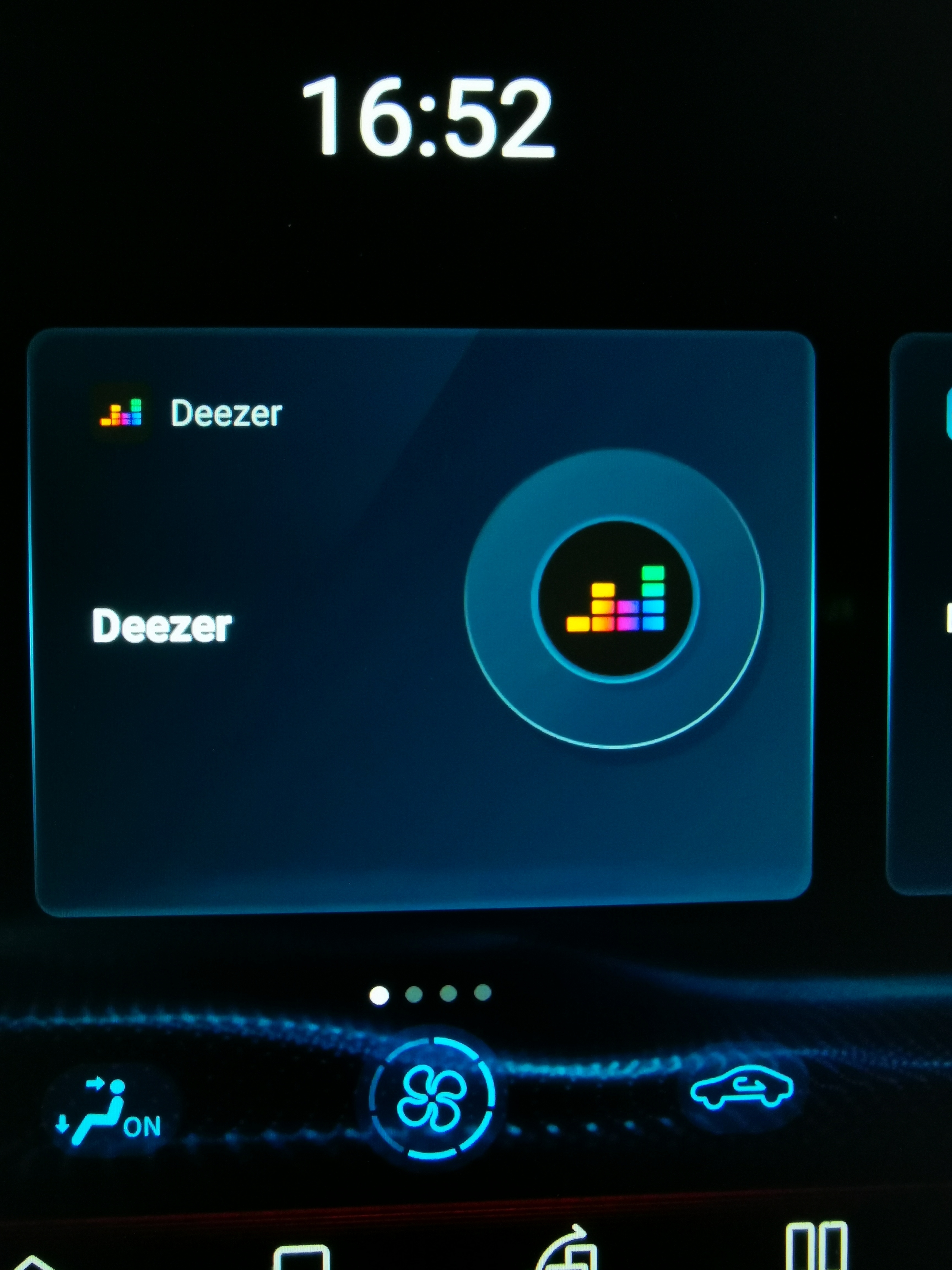
A purple heart can never ever replace the orginal deezer logo in my car

 +3
+3
Icon looks like dating app, desktop app still electron with the same bugs (icons don’t work, can’t close with close button....). At least you could fix these bugs :(
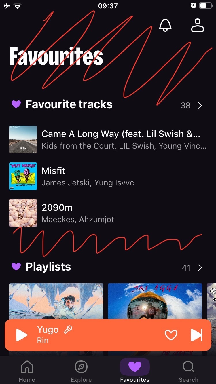
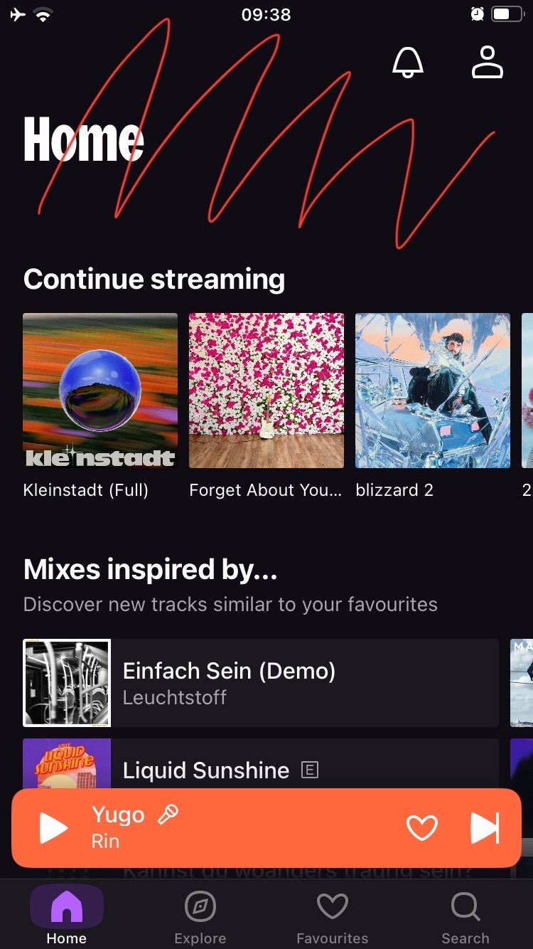
Now playing screen was the most outdated thing in the entire app and they literally updated everything except it.
Also, new logo looks like a dating app. I want the old one
The new logo is horrible, just like @jirikovoego said, it looks like a dating app
The new logo symbolizes the millions of Deezer fans suddenly crying out in terror and were suddenly silenced by corporate BS and woke agenda.
I like more the old logo,a purple heart, is this an April 1 joke 😞😞
Now playing screen was the most outdated thing in the entire app and they literally updated everything except it.
Also, new logo looks like a dating app. I want the old one
They got it so wrong. If the objective was to design in the total opposite direction of the mobile industry, job done.
Guess What...?
you are about to shoot yourselves in both feet?
You've fallen for marketing waffle and been suckered out of a boat load of cash in the process?
You've asked 5 year olds to do a redesign of your corporate branding?
You are trying to help your competitors by driving your own customers to them?
Your brand is an icon. It is how people have grown to know your business but you dont give two 💩💩?
The purple heart logo symbolizes the “wounded” app after this unfortunate redesign.
I honestly don’t mind the new design. I don’t think Deezer needed to do a major update like this, but whatever. I don’t like that it’s getting closer to what Spotify looks like. There’s a reason I don’t use Spotify, and their UI is like top 3 reasons.
The worst part of this update is the now playing screen. The swipe down gesture is so much worse. Half the time it accidentally plays the next song instead of swiping down to the tray.
My swipe down doesn’t even function.

crossfade was removed!! We want it back!!
I like the new design, just think the marked spaces waste to much space on my small 4,7” iPhone.

 +5
+5
The new logo symbolizes the millions of Deezer fans suddenly crying out in terror and were suddenly silenced by corporate BS and woke agenda.
I’m wondering why you would associate purple of the new purple icon with woke? What’s woke about the colour purple?
 +1
+1
The new logo symbolizes the millions of Deezer fans suddenly crying out in terror and were suddenly silenced by corporate BS and woke agenda.
I’m wondering why you would associate purple of the new purple icon with woke? What’s woke about the colour purple?
Nothing, but some people are far too lost with the “woke” term, which they cannot even explain when you ask them. Every time you hear “woke” from someone, just ignore them. It’s not worth engaging with such people. They are afraid of colors, rainbows and anything different then their internet echo chambers.
A new design i guess

+5
I was quite surprised about the update. iOS, Android and web.
Now the Community site still has to change.
A new design i guess
worse one
+8
Deep Purple: Deepest Purple (30th Anniversary Edition)
Somehow missing in the “Deezer just got a lot more purple” section. 😉
Get back the old logo. Its colourfull and dont look like a dating app from Twitch.
its a music app and its not a love dating app.
the rest i can adapt to. Its still easy to navi.
atleast give the option to chose the app icon. I dont like the new one, and will never like it. Its not music related at all.
I have a few pet peeves like lots of wasted space in headers and a few bugs but I think the redesign is neat, good job on not pulling spotify-grade shittification redesign!
...and man I love purple
+5
I’m glad that the look and feel, the layout if you want to give it a name, is still easy to navigate.
The layout is still quite soothing. And like
And I love being different from the standard and what everyone else has.
Enter your E-mail address. We'll send you an e-mail with instructions to reset your password.