


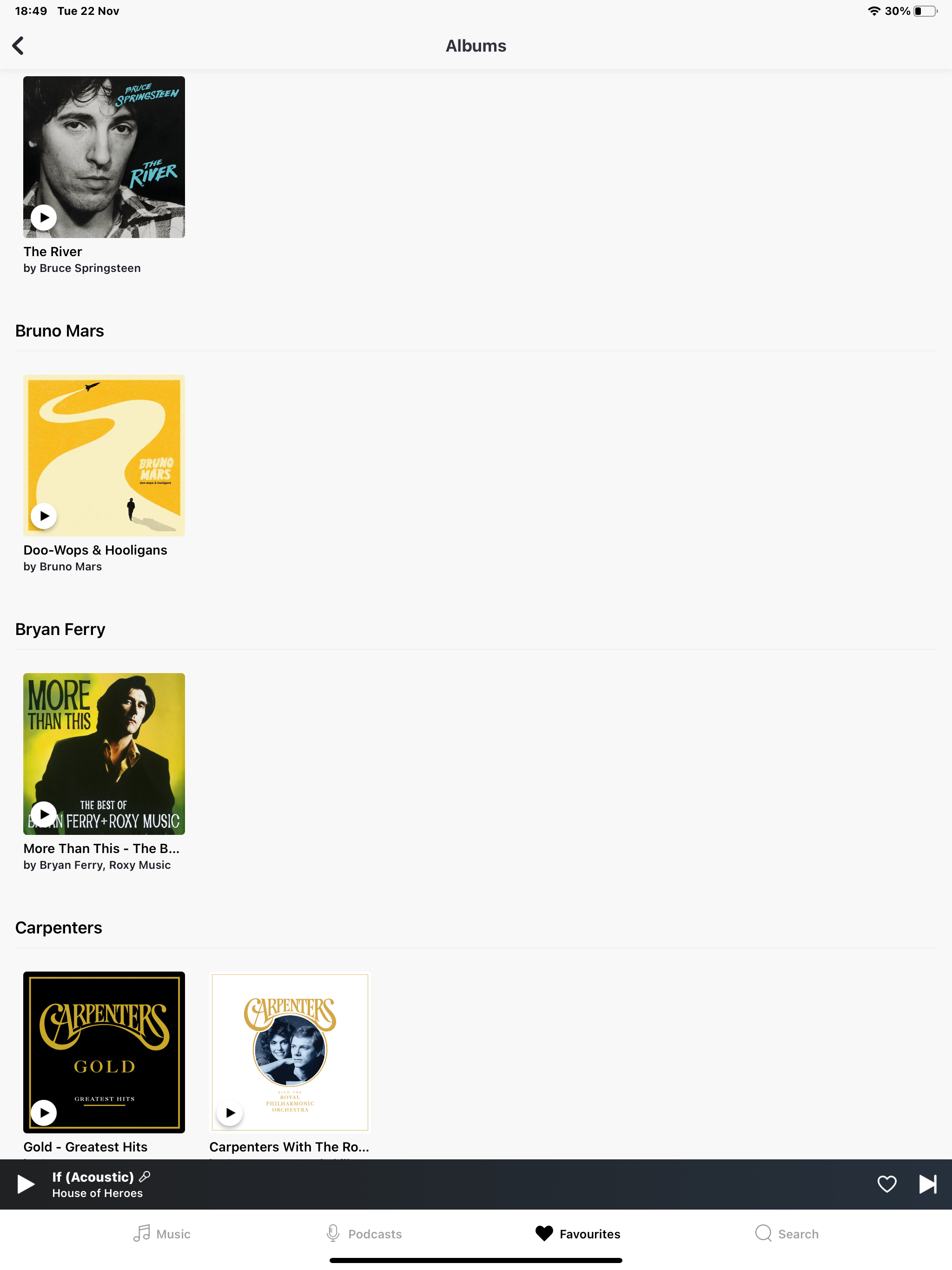
Why is the iPad interface so bad? On album view I end up with loads of white space where the artist has just one album in my collection. If it could be sorted by artist but without different sections for each artist it would look miles better and make much better use of the space. Or look at the way Spotify handles it-far better.

Answered
ipad interface
Best answer by David Green
Hello. Please see screenshot showing how bad it looks. It could still be sorted by artist but following on without the crazy gaps
Thanks
This topic has been closed for comments - the content may no longer be relevant or up-to-date, so please search for keywords so that you can find a newer post or look below for a direct link


Enter your E-mail address. We'll send you an e-mail with instructions to reset your password.