The New Updates UI is Terrible


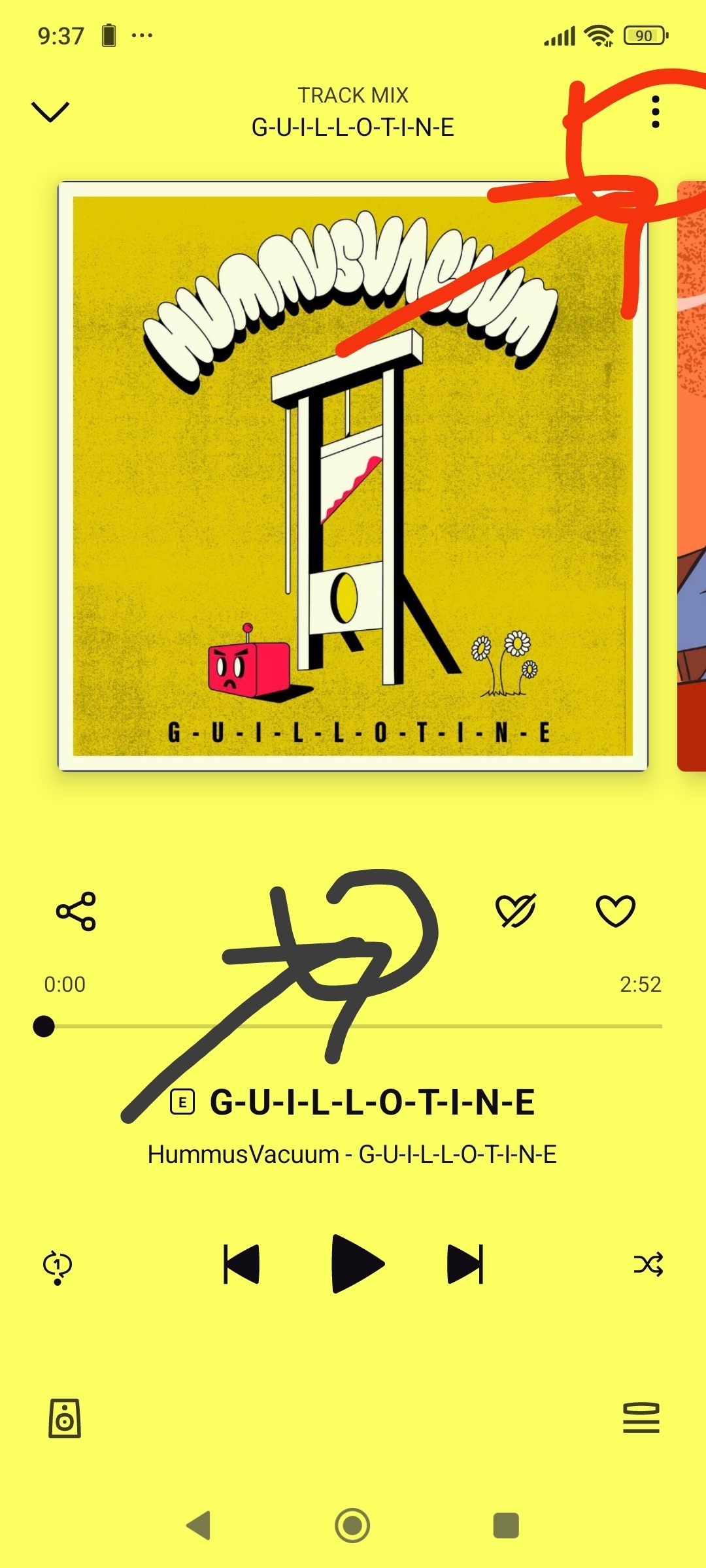
The new Deezer UI is just made the extra info about artists (with the " : " icon) much harder to access, without any particularly justifiable reason. I understand that they're rolling out a new algorithm that needa there to be more space for the new like and dislike button, but as someone who usually enters an artists page / the album page from a specific track, this change just makes Deezer much more of a hassle to use, and the UI couldve kept all three buttons. What irks me about UI changes like this is that the user doesn't have the choice to opt in or out, and that they can't use the old UI if they prefer. I feel forced to sacrifice my experience for a feature that I probably wouldn't even use.

5 replies

Forum|alt.badge.img
  • Runaway Baby
  • 5 replies
  • April 17, 2025

I totally agree with you. This is complete nonsense.if i want to this ui i want to use sootify.Please be original.


New interface is total shit - amateurs. Switch to Spotify !


awesomemac
Deezer Legend
Forum|alt.badge.img+5
  • Deezer Legend
  • 1600 replies
  • April 18, 2025

Hi,

I'm trying to understand which new adjustments in Deezer are less pleasant for you. When I look at an artist and I want more information about this artist, I scroll down and I can see the information there, if available.
Do I understand correctly that this is what you mean?

I understand that a change is not always good for everyone, but if Deezer (or any software company) has to keep a "fallback version" in order to have the old version, this is ultimately not possible with millions of users and millions of wishes.


  • Author
  • Runaway Baby
  • 1 reply
  • April 18, 2025
awesomemac wrote:

Hi,

I'm trying to understand which new adjustments in Deezer are less pleasant for you. When I look at an artist and I want more information about this artist, I scroll down and I can see the information there, if available.
Do I understand correctly that this is what you mean?

I understand that a change is not always good for everyone, but if Deezer (or any software company) has to keep a "fallback version" in order to have the old version, this is ultimately not possible with millions of users and millions of wishes.

Hello, this is mostly what i am talking about: The button that was at the black circled icon, moving to where the red circled icon is.

I used this button all the time while browsing tracks, to get a quick and easy way to get to an artists page or the page of the album the track was on, and now (in user experience terms) i have to force myself out of my way to be able to view those. 


I understand that not every update will be suitable for 100% of users, but i still dont see the developmental need for this button to be moved. It could have stayed in its original design, and there wouldve STILL been room for the new like and dislike buttons for the new algorithm. The change feels arbitrary, unnecessary, and i cant help but feel that it only worsens the Deezer experience without any positive gain.


awesomemac
Deezer Legend
Forum|alt.badge.img+5
  • Deezer Legend
  • 1600 replies
  • April 18, 2025

Now I understand, thx.

Well, only time will tell if this is the right move or Deezer will change it back.


Reply