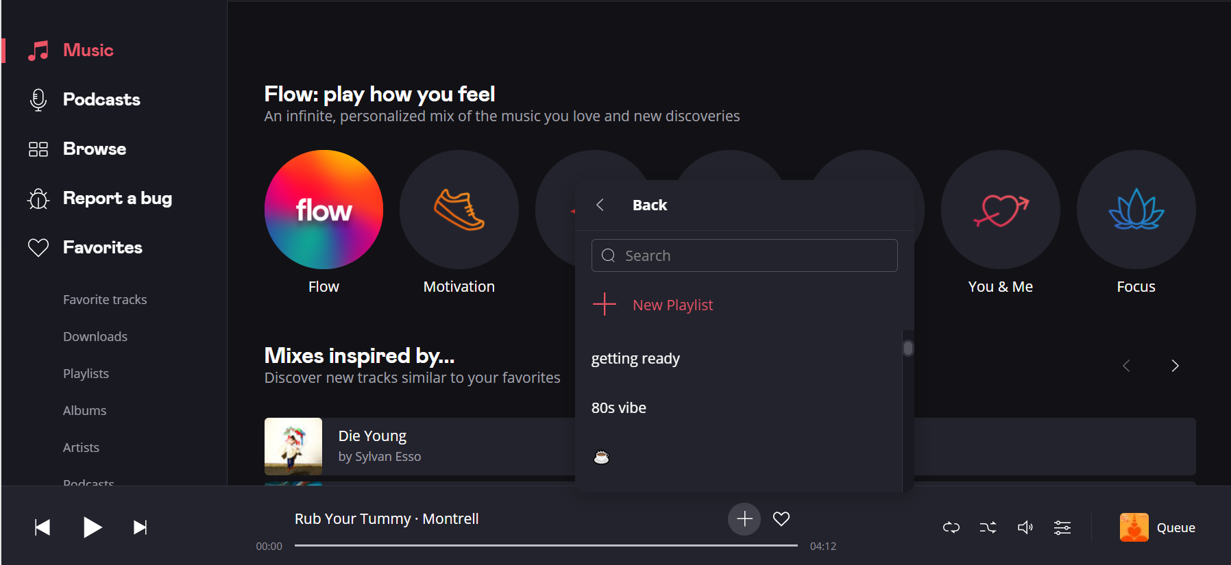
On desktop app, when adding a song to a playlist, the little window that pops up when pressing the + button is too small. You can only read the 3 first names and scrolling through there is a hassle.
There is so much room, why not use it ? Can this please be made bigger ?
Best answer by Yula
Hey @Otacon, this is not really a bug but simply a design/personal taste choice. Scrolling down only takes a few seconds and there is also the option of typing the name of the playlist to make it faster. Probably if the window was bigger somebody would complain that it was too big.
Did this topic help you find an answer to your question?
This topic has been closed for comments - the content may no longer be relevant or up-to-date, so please search for keywords so that you can find a newer post or look below for a direct link
On desktop app, when adding a song to a playlist, the little window that pops up when pressing the + button is too small. You can only read the 3 first names and scrolling through there is a hassle.
There is so much room, why not use it ? Can this please be made bigger ?
Regularly update the app to the latest version available. Developers often release updates that address bugs, improve functionality, and incorporate user feedback.
Hi Yula yes thats the look I mean. It would be more convenient to see as much names in our playlist as possible. Now you can read only 3 at a time which is a hassle having to scroll through and takes unnecessary extra time. If there would be more lines readable at once it would be easier to find the playlist you want to add a song to.
There is so much space above the window, why not use it? Especially if you look at it bigger/fullscreen, it would be logical to have it adapt to the full height available to make it as convenient as possible, don't you think?
Hey @Otacon, this is not really a bug but simply a design/personal taste choice. Scrolling down only takes a few seconds and there is also the option of typing the name of the playlist to make it faster. Probably if the window was bigger somebody would complain that it was too big.
Hi Tula, i didn't say it's a bug though. And what you're using as reasoning to dismiss the request is just a random assumption..
Here I am asking for it, based on actually experiencing the need for it and you're just putting it off based on your assumption that "someone will probably/maybe complain if changed".
The same design choice has already been made on phones, it would make the same amount of sense to use the space available on desktop as well. Did anyone ever "complain about it being too big" on phones so far?? Wouldn't make sense.
We have lots of playlists, lots of us users don't remembers the exact names of all of them, making "having to scroll through" an often occuring thing. Saying you can search for it doesn't solve the fact that the window is unnecessarily small. Using the space available could only make the app more user friendly.
Maybe giving the user the option to have it bigger or smaller would be best. Although I see no logical reason for it ever being "too big" for anyone. Once you're on a desktop it doesn't really matter if you have to travel a bit more up to maybe go click the search box. Compare this to having to squint and focus on just 3 lines that you have to scroll through an entire playlists list with, makes a solid case don't you think?
I see your point, @Otacon, I wasn’t dismissing your feedback sorry if I communicated it that way.
I would suggest you create an idea in our Ideas section try and get as many vote as possible to make a good case for us to push your feedback to our tech teams!