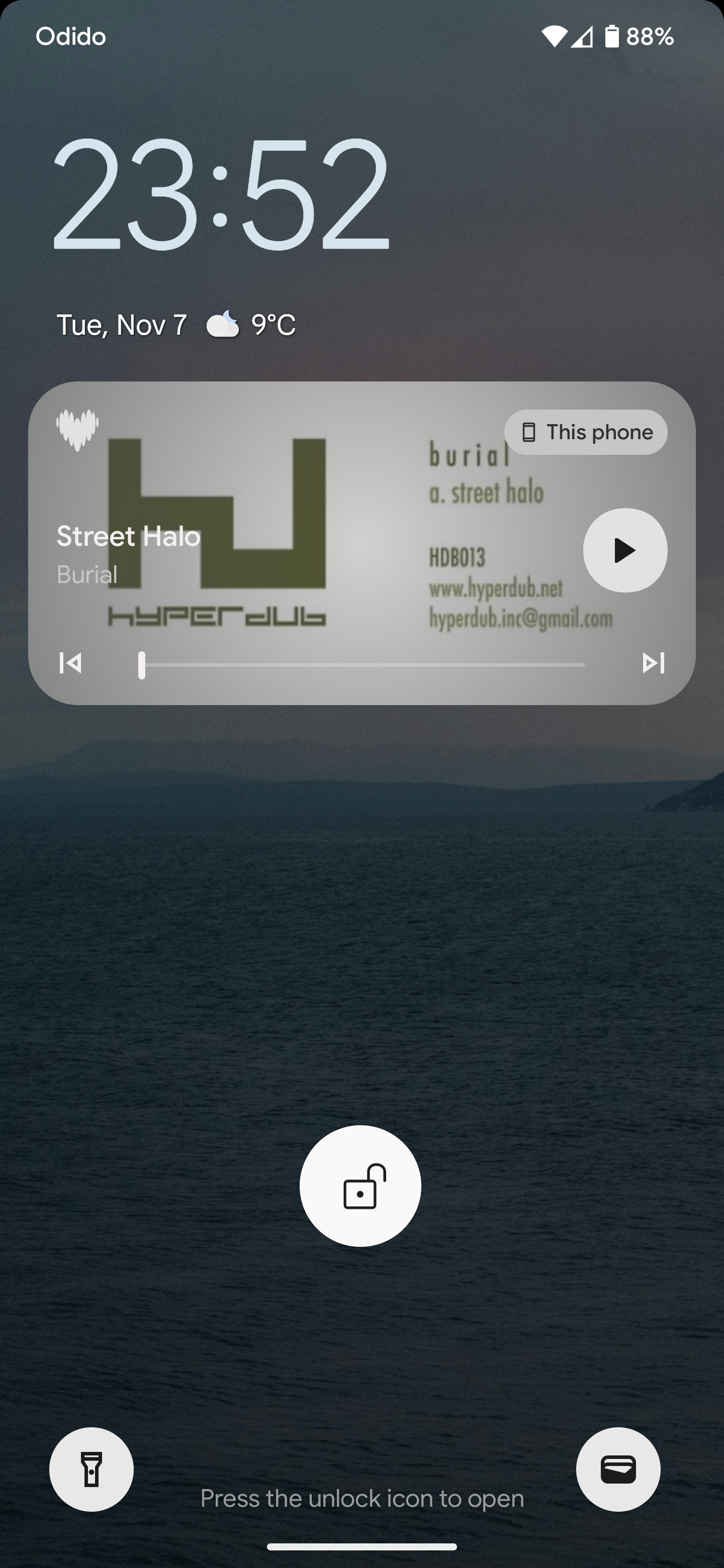
Why is the logo a heart? My friend thought I was using a dating app. The old logo was a great match, it was clear it was about music and recognisable. If you want to rebrand, update it. Why a heart? Look how weird this looks in a music player on my lockscreen. What is a heart doing there? Not to mention the bright purple app icon I had to remove from my homescreen because it stands out so much (in a negative way) Just do the old logo, add monet theming and bob’s your uncle.