When I listen to my music, I also like to look at the respective cover pictures.
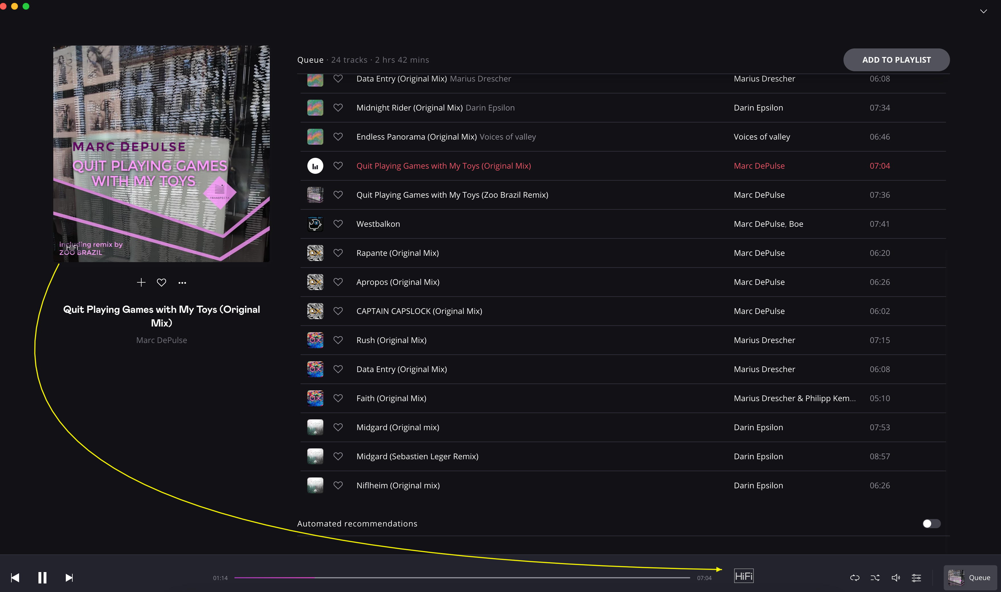
It happens again and again that the word “HiFi” covers part of the cover and I cannot see what is actually on the lower left of the cover picture.
It would be nice if the presentation of the audio quality were to be relocated entirely to the lower range. There is plenty of space. ![]()
It could look like this as an example: