Hi Deezer team,
I have a question regarding the current player layout on iOS:
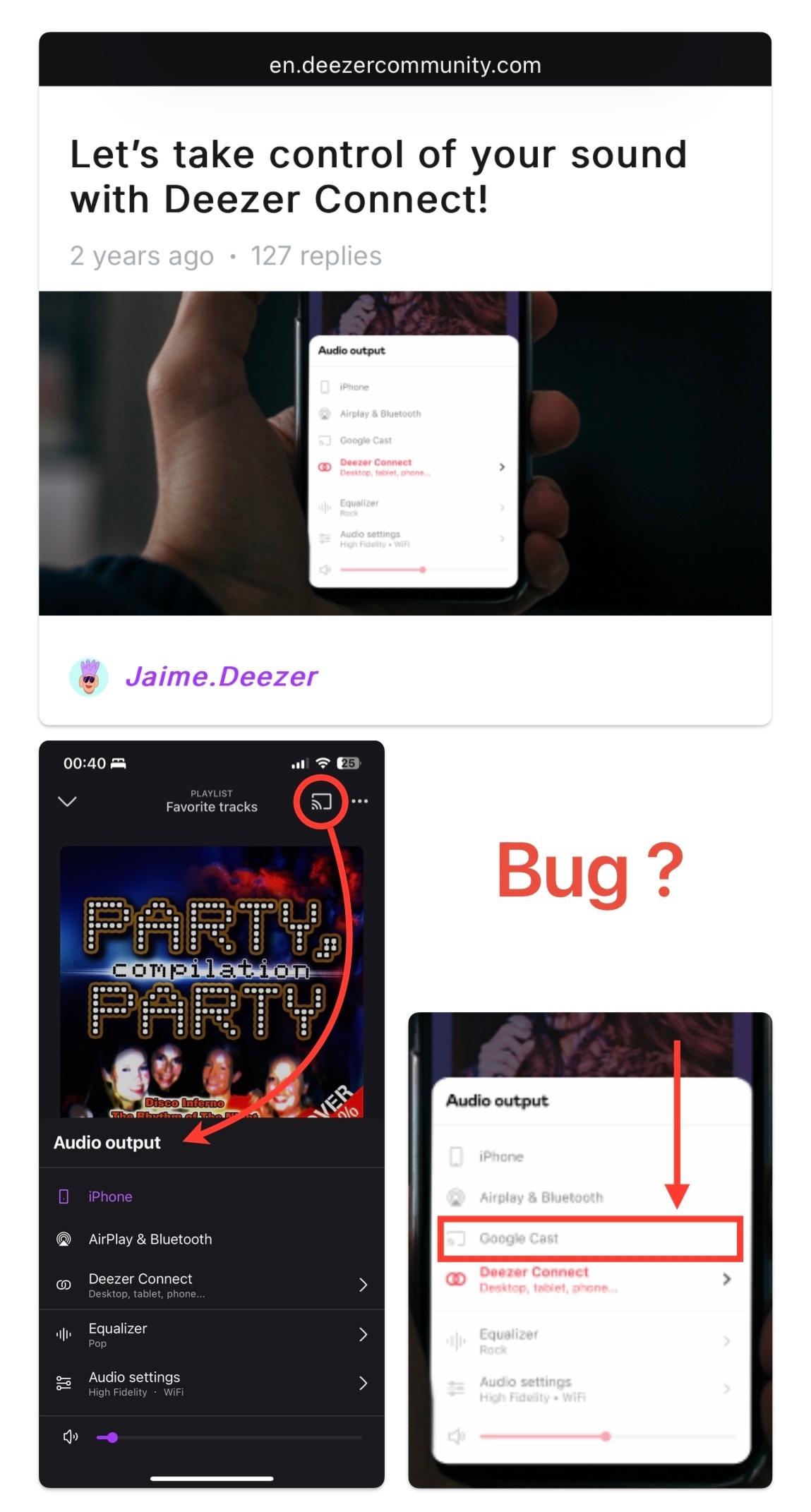
Why does the Google Cast icon still appear in the top right corner, instead of being grouped within the Audio Output section (bottom left), alongside AirPlay, Bluetooth, and Deezer Connect?
In your own official guide (Let’s take control of your sound with Deezer Connect!), Google Cast is shown exactly where it logically belongs — as part of the unified output menu. Why is it treated differently in the current iOS layout?
This separation feels inconsistent and visually cluttered — especially considering that AirPlay is hidden in Audio Output, while Chromecast gets its own button on top. Why the imbalance?
Even more confusing: the Cast icon disappears when Wi-Fi is off, which shows it’s dynamically triggered. If it can vanish, surely it could also be relocated just as easily to the proper section?
A few updates ago, the Sleep Timer button was removed from the bottom of the screen — yet the Chromecast icon was kept in that top-right position. Wouldn’t it be more logical to group all playback outputs (including Chromecast) together under Audio Output?
Also, as a small ergonomic tweak, you might consider swapping the position of the Share and Options (…) buttons — so the options menu is easier to reach with the thumb.
Thanks for your time — looking forward to a cleaner and more unified interface!