


Hello.
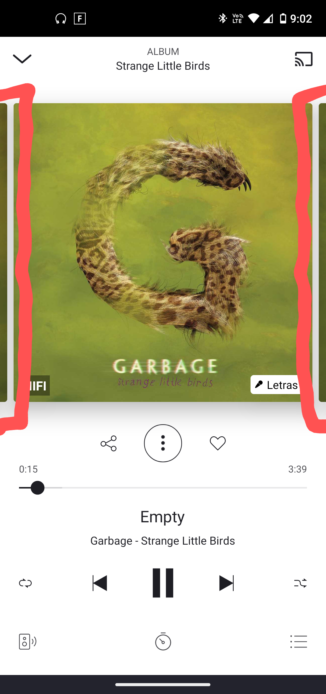
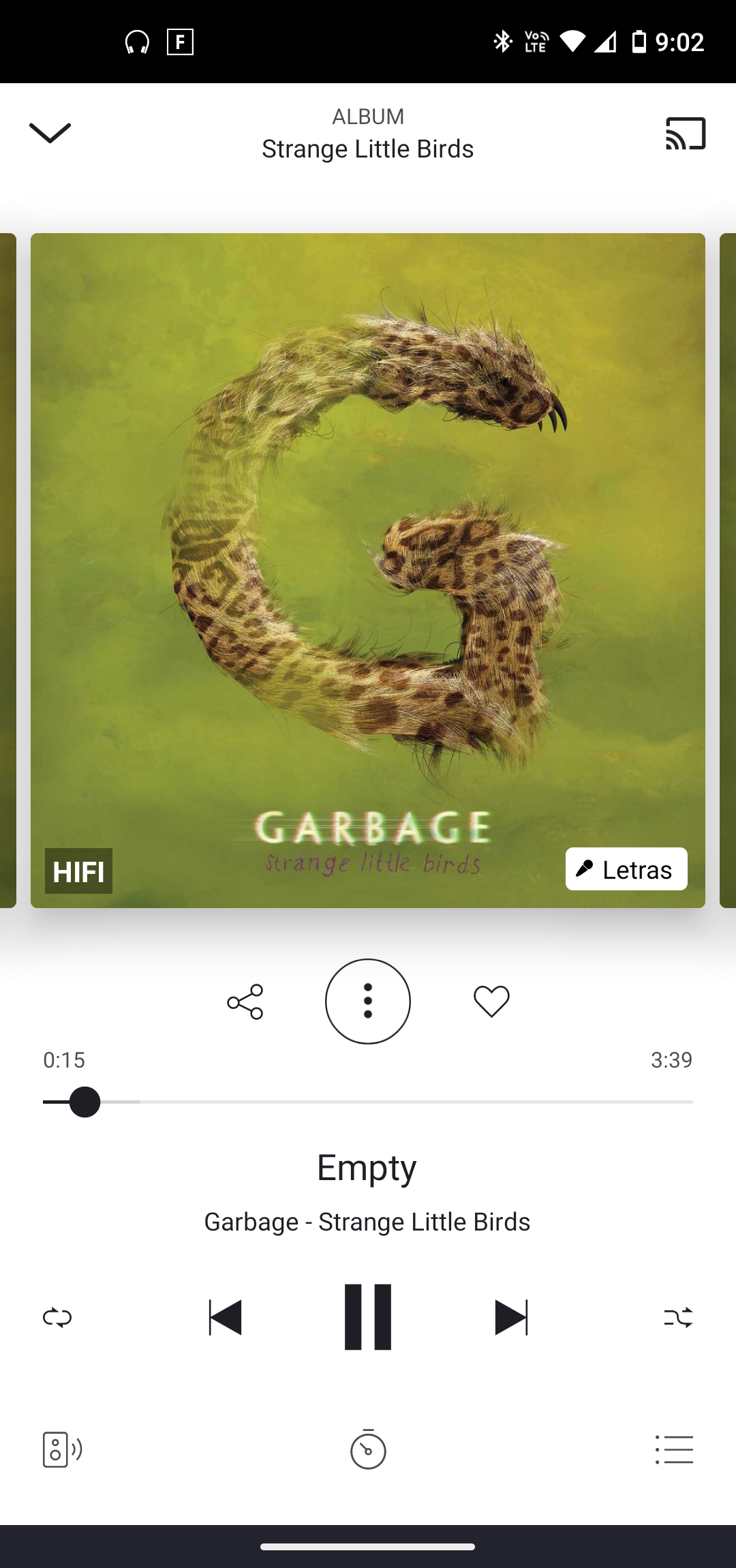
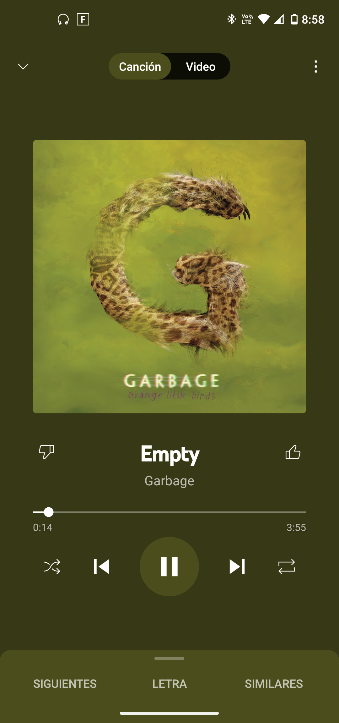
The music player on the mobile app for Android looks ugly because the album covers are to close to each other. This only happens with Deezer (not YouTube Music, not Spotify) so, why don't you increase the space in between them to make it look cleaner?
Here are some pics to show what I mean:

Thanks.

