include

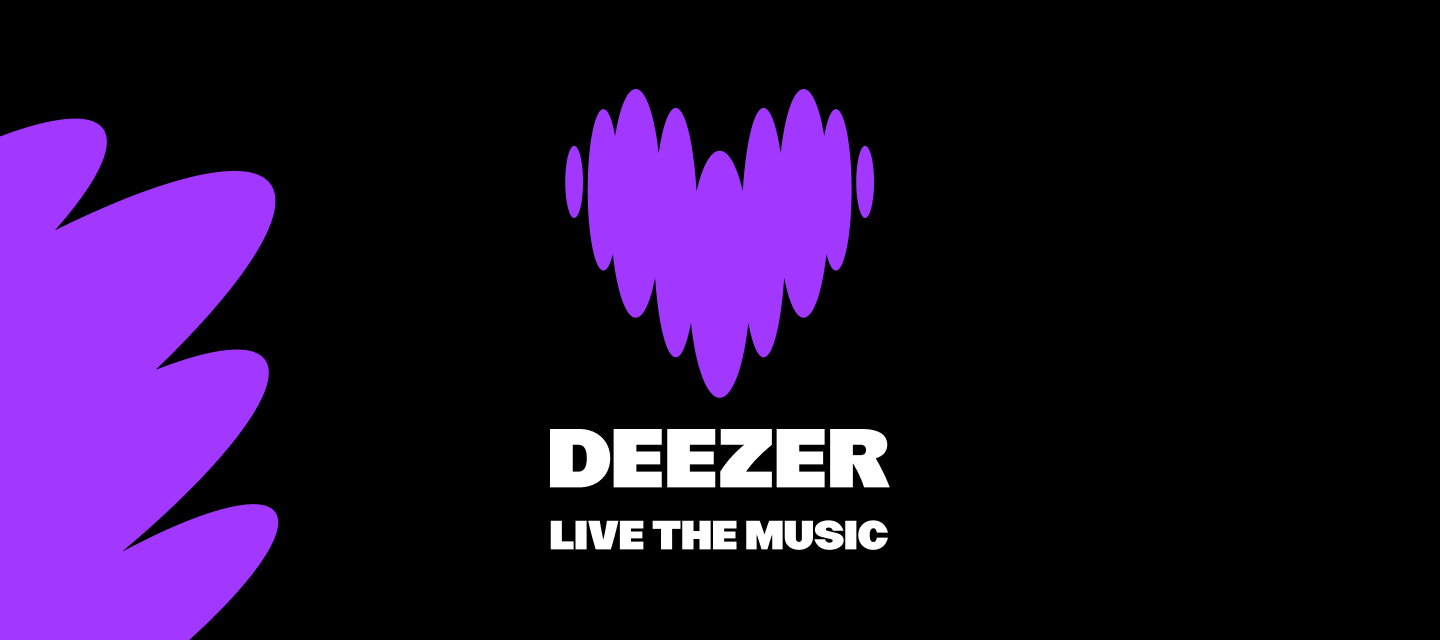
New logo: Explanations 💜

  • 10 November 2023
  • 528 replies
  • 12345 views
New logo: Explanations 💜

Show first post

528 replies

Userlevel 4
Badge

New design is awful and icon is atrocious. Looks like a dating app for a specific demographic. 
 

Why Deezer?! You had the most beautiful, elegant and user friendly app before. I guess I will finally skip to Apple music. 

Userlevel 4
Badge

I’m moving to Apple Music now. Bad move Deezer. No one likes such a drastic change. I am baffled that anyone at Deezer found this new design a great idea, objectively speaking. To me it looks like politics got involved.

So disapppointed with the new logo and even the font used in the app. It feels it’s for kids whereas before it was sleek and sophisticated. definitely considering moving to Spotify now.

The app now looks like it targets teen girls!

Userlevel 5
Badge

Yeah i just sent a help request to see if I can change it somewhere in settings or whatecver.

looks like YT and Twitch had an aborted baby.

If they stick to this design, I know I wont be extending my premium.

Deezer already looked OK and worked FINE. thats why I choose Deezer over other options.


Like people above me stated, feels like they rather wannabe another “social media”


You are not, you are DEEZER. I PAY you PLAY. nothing more, nothing less.

If Deezer thinks I wont vote with my wallet, they are mistaken.

The list of companies I never use services from is growing every week.


Dont do this to us Deezer. Fire your design team, or whoever approved of this and change back the UI

Userlevel 6
Badge +5

As a long-time Deezer user I’m really disappointed by what I see here. Instead of making functional changes, fixing long-outstanding bugs and adding features their users have repeatedly asked for, Deezer appears to have spent considerable effort on destroying their established brand and transforming the interface from something generally professional and polished looking into something that looks bloated, unprofessional and juvenile.

Userlevel 2

The font design is really unfortunate and the whole thing looks quite cheap right now.

The comparisons to Fortnite UI are accurate.


Also I think not having the favorite albums, tracks etc. available right on the front page is an outrageously bad UI choice.

For me the FLOW things are absolutely useless and now take almost half of the front page.


The familiarity and minimalism of the user interface were the only things keeping me on this platform while constantly being bombarded by Spotify links from my friends.

Please fix.

Agree I dont want a heart. It's like something from My Little Pony or Barbie. Please change it. The old tried and true logo is good enough for me. 

Userlevel 3
Badge

Time to say goodbye to Deezer after X years. Much more expensive than Spotify/Apple music and now the absolute ugliest.

Fire the designer who designed it or cut off his hands so he can never create anything like it again.


The new UI is absolutely awful, objectively. It’s messy, it’s ugly. Literally no one asked for the redesign, why would you move things around when we’re all used to the platform as it’s been for YEARS. Just because something hasn’t been changed in a while, does NOT mean it should be changed. This is was some busy body who took it upon themselves to tell the dev team to redo the entire interface to satisfy their own ego.


I WILL be leaving this platform for spotify if the old UI isn’t brought back.

Userlevel 4
Badge +1

So the new interface is, subjective. Personally I don’t like everything this rounded, its a weird round-squary shape, I’d prefer someone just making a choice. I don’t like how the fonts aren’t consistent. I don’t like the font used for a playlist name, but the more clean font that I’d prefer still is at other places. Also player background still often mismatches the actual album cover.


Apart from interface changes, which I would like to see be more user selectable, the useability got worse.


  • The most simple thing: swiping down to hide player. Why is that gone? It’s such a nice fast way to see the playlist or album again. 
  • Other thing, favorite tabs should have recently player or recently updates playlist without requiring one additional press to go into the complete playlist list.
  • The sorting option also now requires extra clicks
  • When adding a song on Android to a playlist, scrolling through playlists doesn’t show the a letter (A,B,C) but Sectio...}}}]).


Also, I’d love monet theming. Plus there is still no decent widget for Android, this was the opportunity. 


I love Deezer, I defend it every time people ask me why not to use Spotify, for me it’s the little nice-to-have’s and intuitive interface that really worked. I’ve been using it for longer than I can remember, and the HiFi quality is an added bonus. This for me a overall step in the wrong direction. Yes, the look is subjective, although I think it is objectively half-done. But the useability did suffer today. I hope that the team once again, listed to feedback and can change some stuff or make it optional in settings.

Userlevel 5
Badge

This conversation is for all give your opinion about the new visual identity of deezer

Userlevel 5
Badge

Deezer Community staff deleted my post with the Poll 🤣🤣

The last time I've see the poll had more then 85% to the Worst Design 🤣🤣

They don't want a to know the opnions of the users

Userlevel 1

I loved “equalizer bars”!!! And the new logo can be a deal breaker! My wife is gonna think I have a dating app on my phone! Come on, Deezer! What have you been thinking!

:(((((((

Why purple? Why heart? It doesn’t match like a music App. Please, change it to the last logo. Much better and nicer.

Userlevel 2
Badge

FAILURE is the only word that comes to my mind if I had to summarize what I feel looking at this botched interface.

How is it even possible to end up with such a badly-thought user interface? So far, I have barely seen anyone liking these new changes. Deezer made one big UI mistake and it’s not like it’s my daily business dealing with UX and ergonomic aspects: never ever ever ever remove working and appreciated features, never! And if you are stubborn and still want to remove them, you must offer a solid and viable alternative that is very well-thought and fail-proof against 95% of your users. They failed on all these aspects.

I won’t even go to far on the purplish theme and the childish font being used (I am a boomer and discovered it’s very close to the font in Fortnite). The logo is ridiculous, it’s not a dating app, I’m in my forties and look like I’m hanging on Tinder looking for Spring Break friends that could be my kids. Worse: I have the web application being set as the first bookmark entry in the top bar in Chrome, so I have a purple heart all the time being displayed in my browser. I am sometimes screen-sharing things with my customers, probable reaction “hey he’s looking for girls? I thought he was married”. THANKS

The design team should have provided a few colors to pick and replace that purple (trying to Twitch us?) which is hurting my eyes, such highly-saturated color that is enforced without any alternative is a good way to induce rejection in your (male) user base. I am not even sure girls are appreciating it either. The wavy thing is not sufficient to convey anything about music, it does not look like a soundwave, rather some scrambled content... When music is being played and you hover over the song, you have a poor circle-like thing that does not mean anything. Why replace that? Keep the well-proven “square” that is meaning “stop” for anybody on this earth who ever used an audio device.

Was this thing even probed by applying it first to a set of users to get some feedbacks? Microsoft at least gives you the option to try the “new” while keeping the “old”. 

same here, i dislike this new design, ugly font and colors, please fire your design team. i want my old ui back if not i will switch to other music app

I think the design is ok but the previous was fantastic. What I liked about Deezer’s previous logo was how colorful it was and the incoporation of an equalizer was clever. I think purple was a good choice for a single-color theme, but I prefer the colorfulness of the old one. Also, the new icons seem too cartoonish for my liking.


One thing that I’d be surprised if anybody likes is the layout of the new favourites tab (using iOS app). The most recently liked tracks at the top is fine, but the playlists section takes up so much space and displays the most recently added (not updated) playlists. If you’re like myself and have a few ol’ faithful playlists that you listen to regularly, it’ll be annoying to find them now since there’s no way to change which playlists are displayed.


I personally don’t see the benefit of this update. At best, you can do most of the things you used to be able to but now in purple, and at worst you have to retrain your fingers’ muscle memory in order to find what you’re looking for. This just feels like change for the sake of change more than any tangible benefit.

Userlevel 1

So I wrote an email to Deezer about their terrible new design and interface and asked can we have an option to have the old one. I also pointed out the number of complaints on the forum about this abomination. Their “reply”:

We've made a strategic shift towards a new brand purpose; 'Deezer helps you be and belong'  going beyond streaming to give fans, artists, and partners the means to express themselves and connect through our products and services.

Refreshing our visual identity is essential as we enter this new age for Deezer. It allows us to connect emotionally with music fans and artists.

The new vision for Deezer is to create an experience services platform around all things music, where we give people opportunities to express themselves and to connect with others.

Matching the brand new direction, Deezer is also introducing an enhanced user experience and design in the app, to inspire and empower music fans to “Live the music” through personalised experiences.

This includes features like FLOW and Music Quiz and the upcoming Shaker, which give people a chance to express their moods through music and connect with their friends, even outside of the Deezer product, around music.

If you have installed automatic app updates on your mobile, you can enjoy the new version since its official release on Tuesday, 7th November at 7.30 pm CEST. If you don’t have automatic app updates enabled, you will have to visit your app store and update the Deezer app manually.

We hope you will embrace the new visual and enjoy the newest Deezer experiences.

You can keep up to date with all things Deezer by Visiting our community

their second reply about how they can ignore customers who pay so much and that they will possible leave:


We have to remain with the reply given here. I apologise for any inconvenience this is causing you.
 
Please let me know if you have further questions. 


Userlevel 4
Badge

When you have to explain to the users the meaning of the changes, you have already lost. All the features and fixes that have been left undone for years, and this is the answer. I  cancelled my subscription for 5 users faster than a purple heartbeat.

Userlevel 4

I’m sorry to tell you but you can keep hoping for the best, it’s not happening.

YOU want our money not the other way around. You should listen to our concerns not impose your identity whatever you wanna call it on your customers. 

And no, refreshing a visual identity is NOT essential if it’s working. Apple iOS still holds its interface pretty well  after almost 2 decades because IT JUST WORKS. 

Microsoft released Windows 11 which was a major change; Community did NOT like it so the company was forced to restore, tweak and implement features based on users feedback.

Have you ever heard of  BETA releases? user opinion?  Ahh you don’t care, reminds me of Nokia… rings a bell? 

BTW,  I bet if you ask random people on the street what could this shiny beating purple heart mean you’ll be surprised... but who cares anyway?

Sugarcoat things as much as you want...your approach towards your clients is enough to make me leave the platform for good.

Good luck with your commercial suicide.

not sure if its just me but im personally not a fan of the new update! strange purple heart, weird bold font and i cant swipe down to pull down my song anymore (small thing but it irritates me). what was this change for lol

Really disappointed Deezer. You had the coolest, cleanest and best user friendly music streaming app out there which is why I have been subscribed for so long. I'm definitely considering a switch to another service now. Please change it back.

Userlevel 3
Badge

Looks like a dating app, and not the good ones.

PLEASE REMOVE OR I WILL CANCEL MY PAID SUBSCRIPTION !!!

Reply