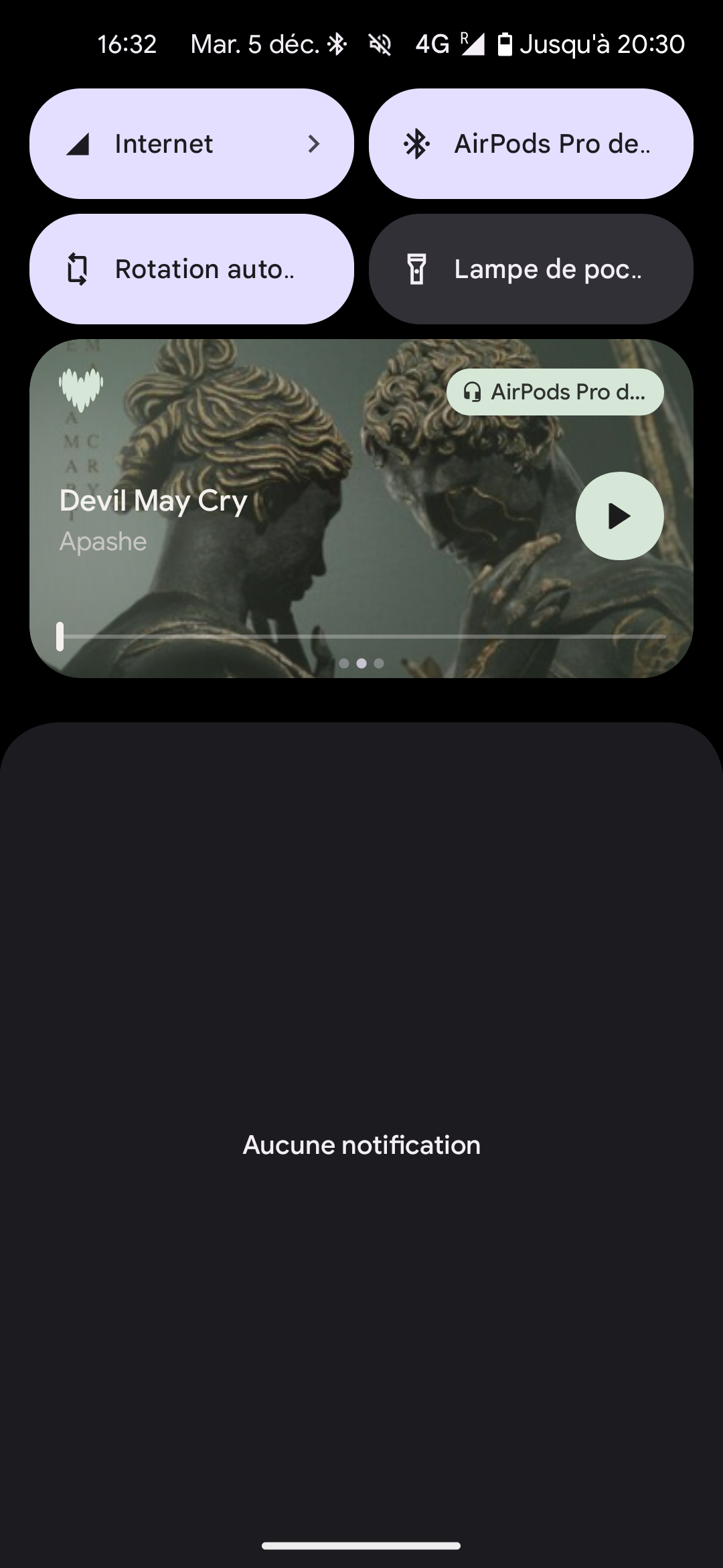
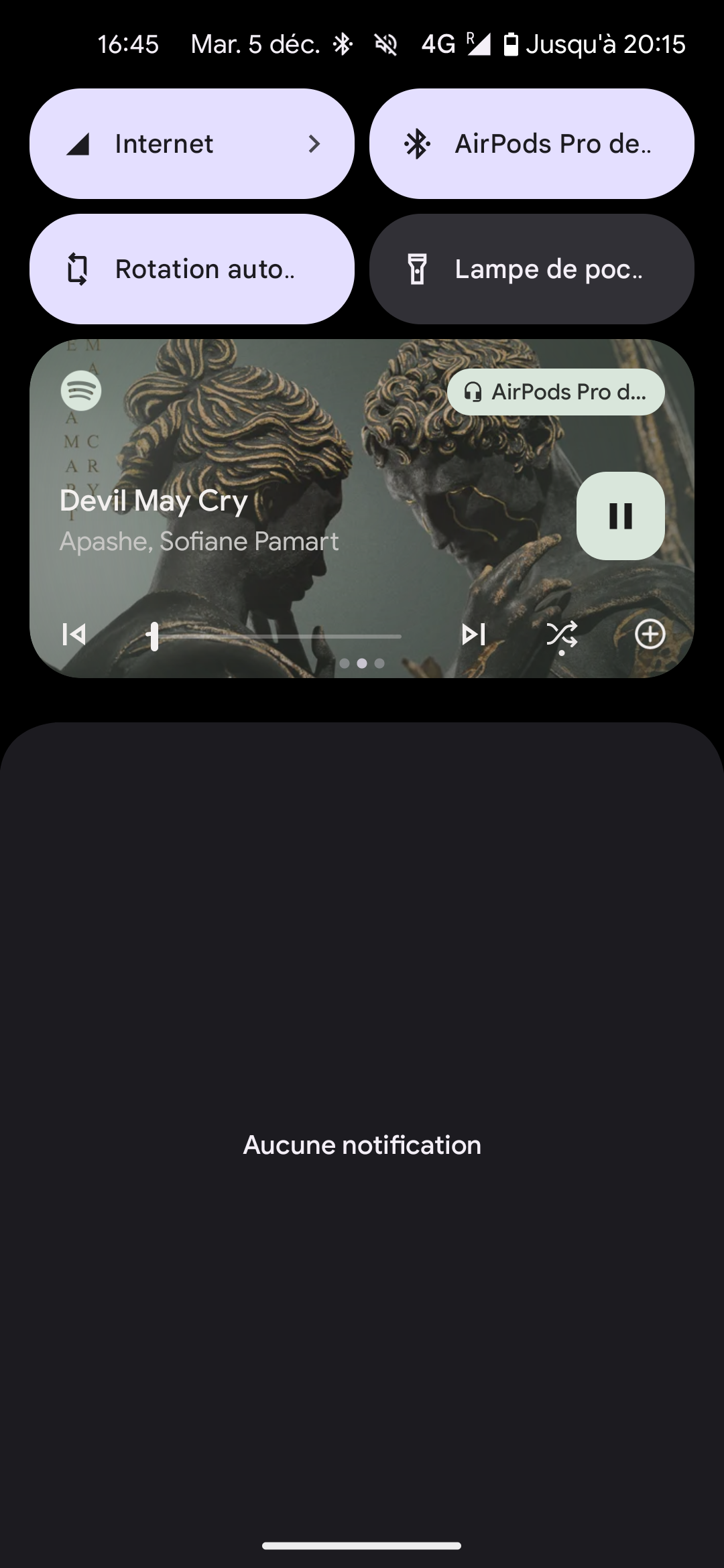
I noticed that the quality of the images of the player on android is low. The player that I talk about is the one on the lock screen and the notification center on my Google Pixel.
I’ve put an example of that, I’m talking with screens. There is Deezer, Spotify and YouTube Music. Spotify and YT Music have high quality. But the Deezer one is in bad quality.
However, images in the app player are in high quality, so it’s only on the lock screen/notification center player.
Also, it lacks of a “like” button and “next music” and “previous music” but I heard that they are working on.
I hope that Deezer will fix that quickly because add a feeling of old app…
If someone of the Deezer Team read this, love you guys


It adds a feeling of bad quality to the app. I think that it’s not hard to implement

