
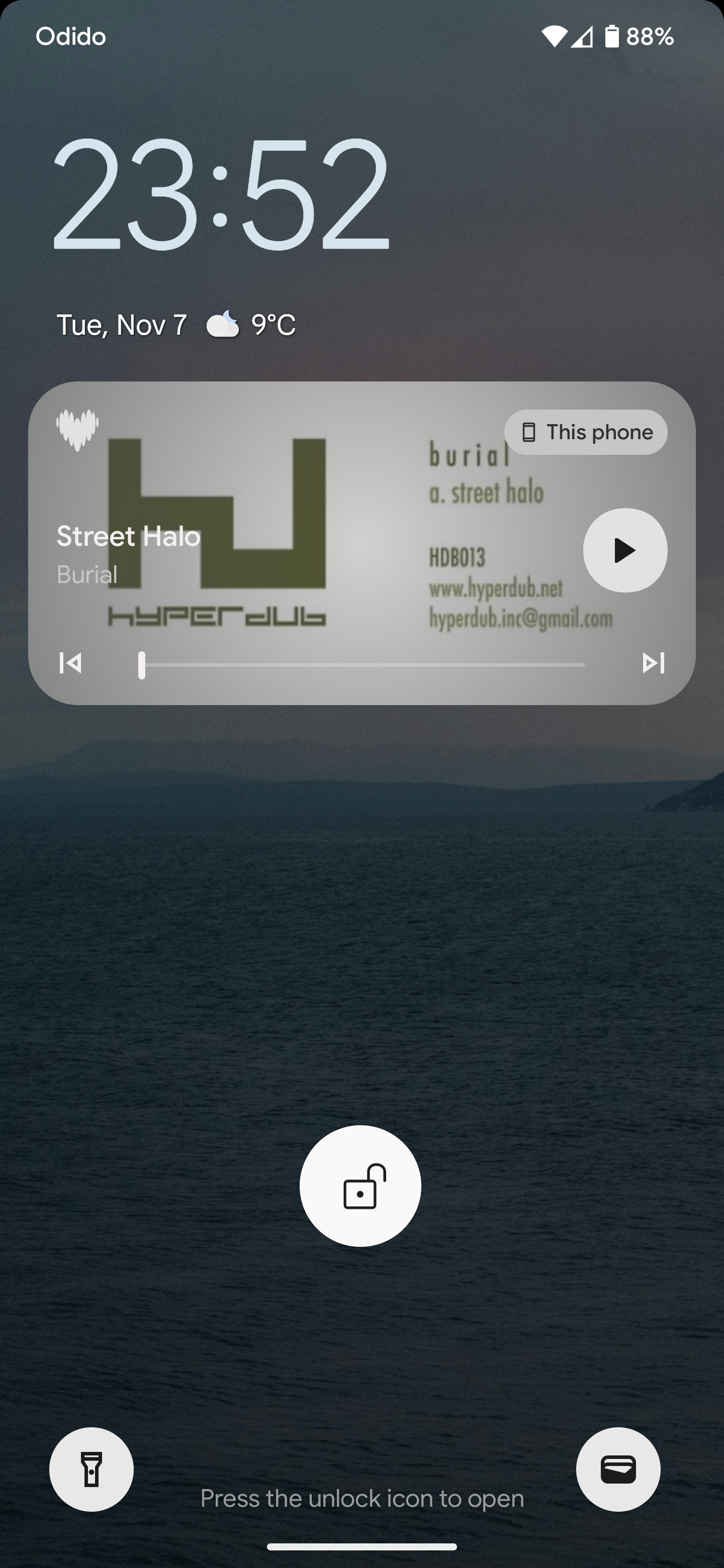
Why is the logo a heart? My friend thought I was using a dating app. The old logo was a great match, it was clear it was about music and recognisable. If you want to rebrand, update it. Why a heart? Look how weird this looks in a music player on my lockscreen. What is a heart doing there? Not to mention the bright purple app icon I had to remove from my homescreen because it stands out so much (in a negative way) Just do the old logo, add monet theming and bob’s your uncle.
if you’re using android their should be a way at least to change the logo that shows up in your app screen. you would have to download an icon pack but once you have it you should be able to find the old logo. i know it sucks badly though
I thought it was some virus or something.
They put lots of “thinking “ and money in it.
I wonder how many people will switch to another streaming just because of this ugly crap.
Fully agree. When I first saw this purple heart I thought it was a sex app and I started panicking !! Thinking of a hack or somewhat. That's the worst rebranding work I've ever seen. How much Deezer paid consultants for issuing this shit?
Fully agree. When I first saw this purple heart I thought it was a sex app and I started panicking !! Thinking of a hack or somewhat. That's the worst rebranding work I've ever seen. How much Deezer paid consultants for issuing this shit?
I need this kind of an app.
Also agree…. some crap explanation
The old logo was great, indeed. Very clear message, straight to the point - just the way I like it. But this one? Meh. I like the redesign of the app itself, though. Call me crazy, but I don’t even mind the purple, to be honest. Just change that hideous misleading logo for cryin’ out loud and it’ll be fine.
Why is the logo a heart? My friend thought I was using a dating app. The old logo was a great match, it was clear it was about music and recognisable. If you want to rebrand, update it. Why a heart? Look how weird this looks in a music player on my lockscreen. What is a heart doing there? Not to mention the bright purple app icon I had to remove from my homescreen because it stands out so much (in a negative way) Just do the old logo, add monet theming and bob’s your uncle.
Purple heart? What does that even mean? You know what? I could not get the pleasure of clicking the icon which I know will give me good music. Crazy!
The logo is a 100% dismatch with the services.
The purple color is terrible to view.
A lot of guys hate this color.
The favorit heart is in red what is a terrible combination with the purple theme.
The old way was much better.
Maybe a poll first in the future?